Project Overview
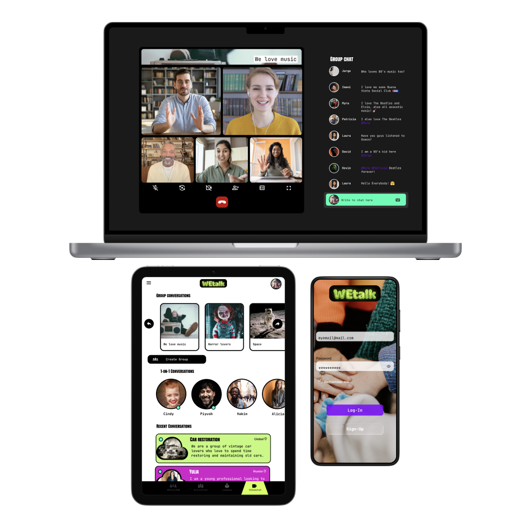
WEtalk is a community platform accessible by mobile, tablet and desktop environments for either learners of English or Spanish at any proficiency level. It offers lessons, activities and language exchange sessions with speaking practice for all learners
The target audience of this product is very wide, so we aim to offer a solid learning experience to any student regardless of their current English or Spanish level. We support this with online activities plus local group activities when there are enough users in their area
The Problem
Students of English and Spanish live accross many regions with a different set of circumstances, challenges, motivations and goals. No every person has physical access to a course or financial means to pay for a language academy. Additionally, many students are unable to find native speakers to practice with
The Goal
Designing an app that helps English and Spanish students learn these languages in an engaging way through lessons, activities, and social interactions, including speaking practice and language exchange sessions in a community where students learn and assist each other
My Role and Responsabilities
ROLE: UX designer leading the app and responsive website design from conception to delivery.
RESPOSIBLE FOR: Conducting interviews, paper and digital wireframing, low and high-fidelity prototyping, conducting usability studies, accounting for accessibility, iterating on designs, determining information architecture, and responsive design
Research
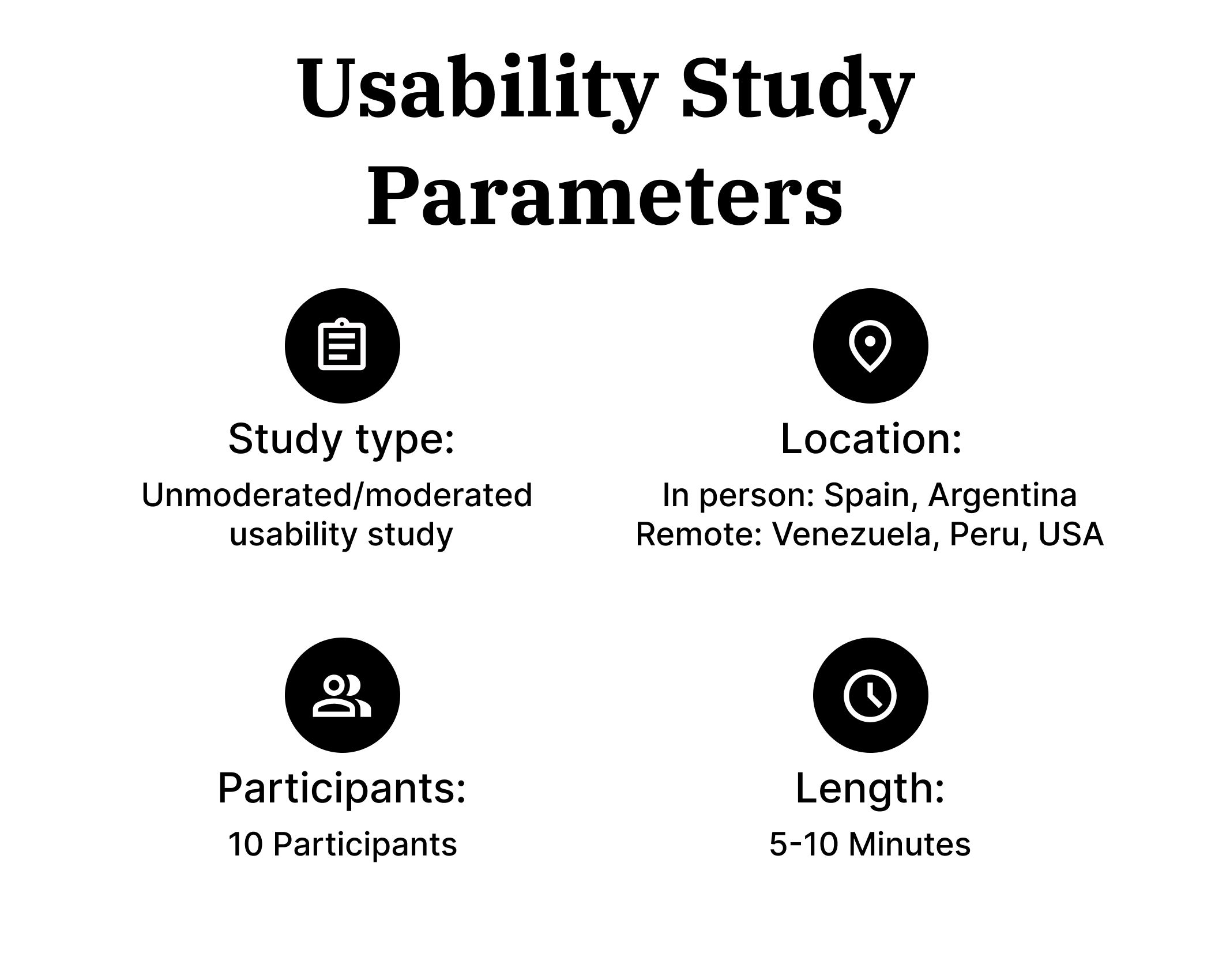
I conducted foundational research in the form of online surveys and interviews both by phone and in person with many students of English and Spanish. The research participants were located in Venezuela, Peru, Argentina, Spain, and USA
The data collected allow me to identify multiple user groups with their very unique set of challenges and pain points including a lack of time, financial resources, no availability of classes in their area, fellow students or native speakers to practice with. One thing they all had in common was owning a mobile device with internet access
Personas
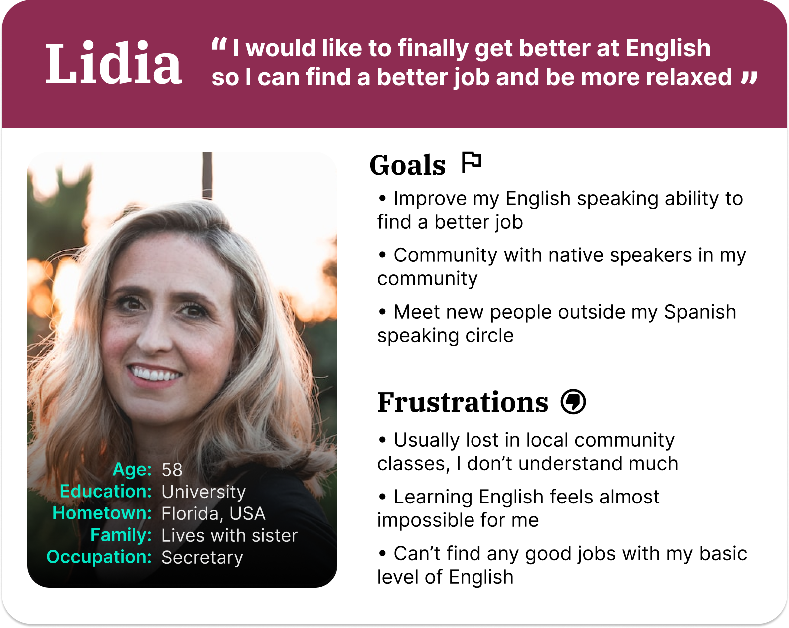
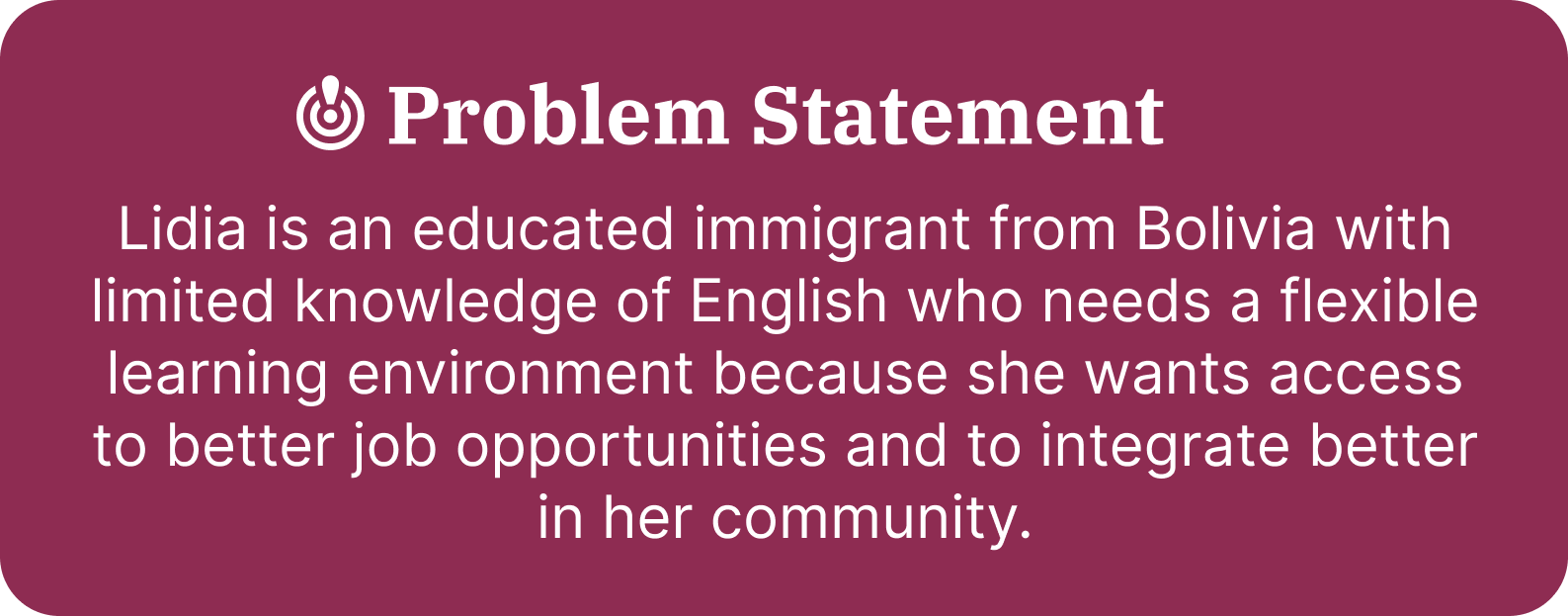
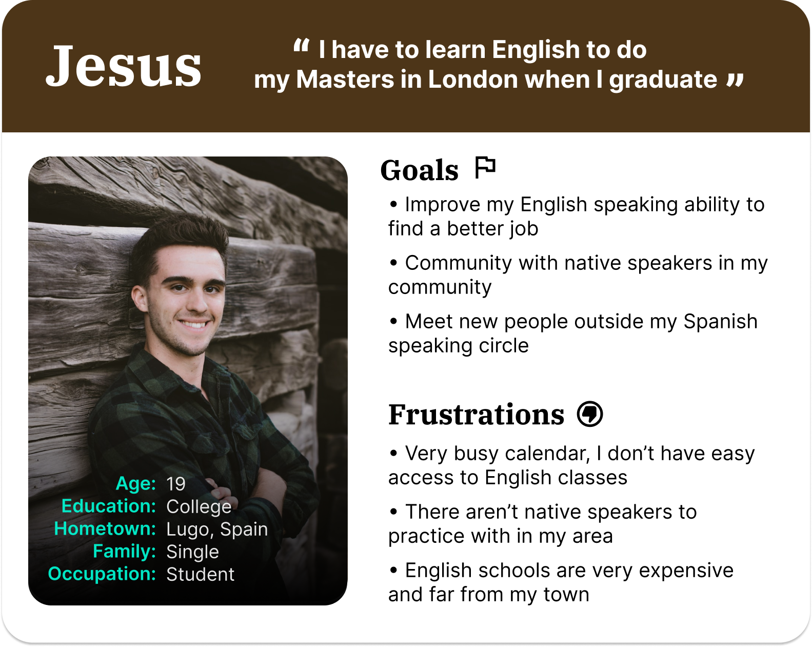
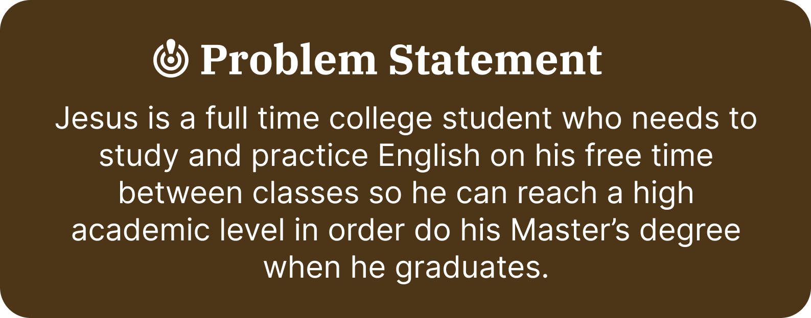
Two main user groups were identified with definining charactheristics based of motivation, challenges and needs. I created two personas to represent these two groups
Competitive Audit
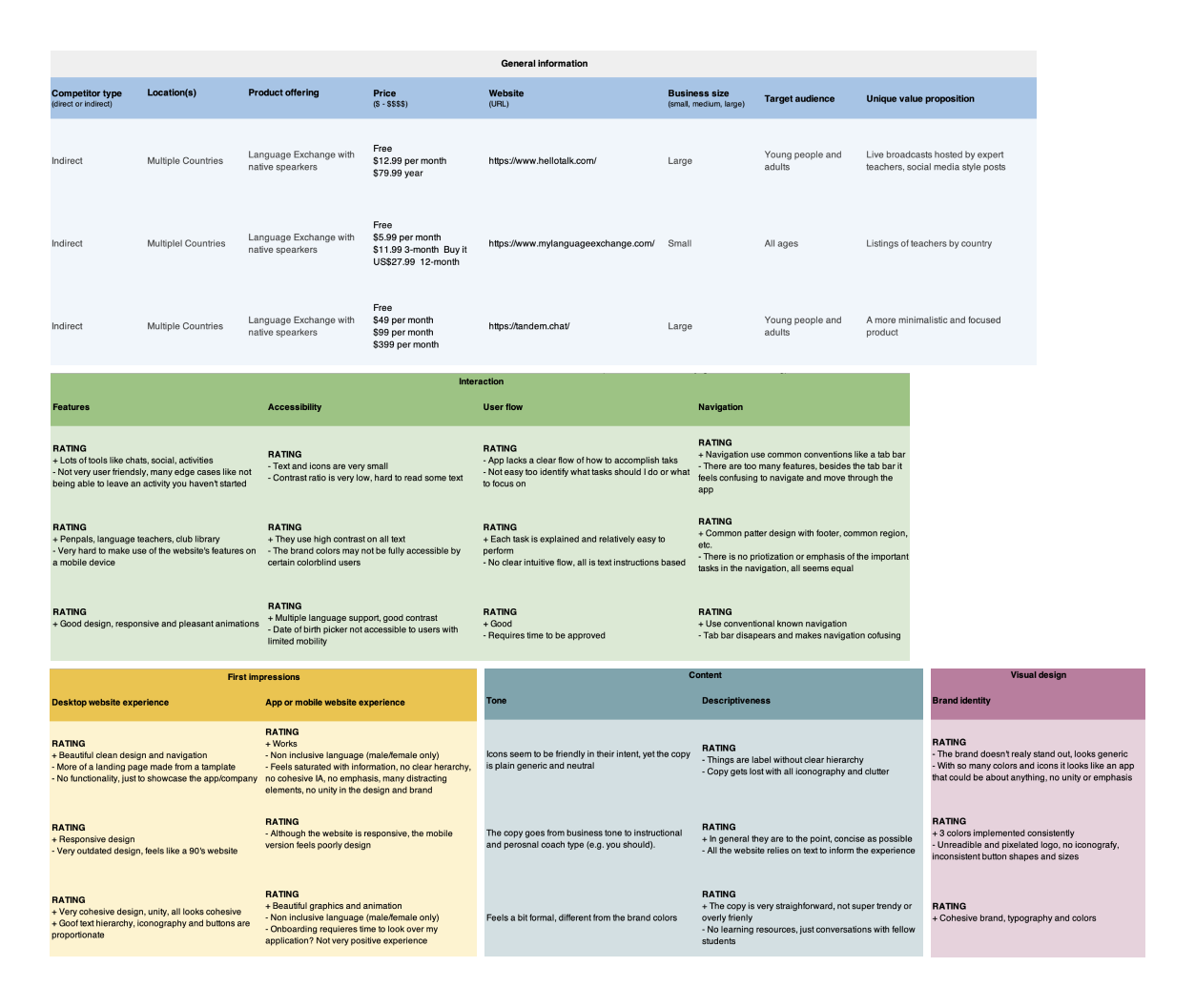
An audit of a few competitor products provided direction on gaps and opportunities to address with the app design. I found that these competitors didn’t provide sufficient lessons and educational resources to support the language exchange and conversations within their platforms
Ideation
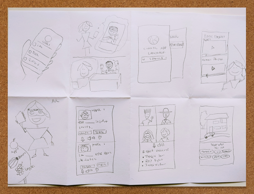
I did a quick ideation exercise to come up with ideas for how to address gaps identified in the competitive audit. My focus was specifically on connecting users with educational resources and opportunities to practice with other users while keeping my personas needs and motivations front and center
Digital wireframes
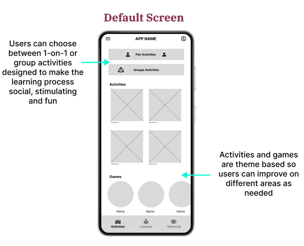
After ideating and then drafting some paper wireframes, I created the initial designs for the WEtalk community app. Users at various language proficiency levels can find adequate lessons, activities, games and speaking partners
Prototyping
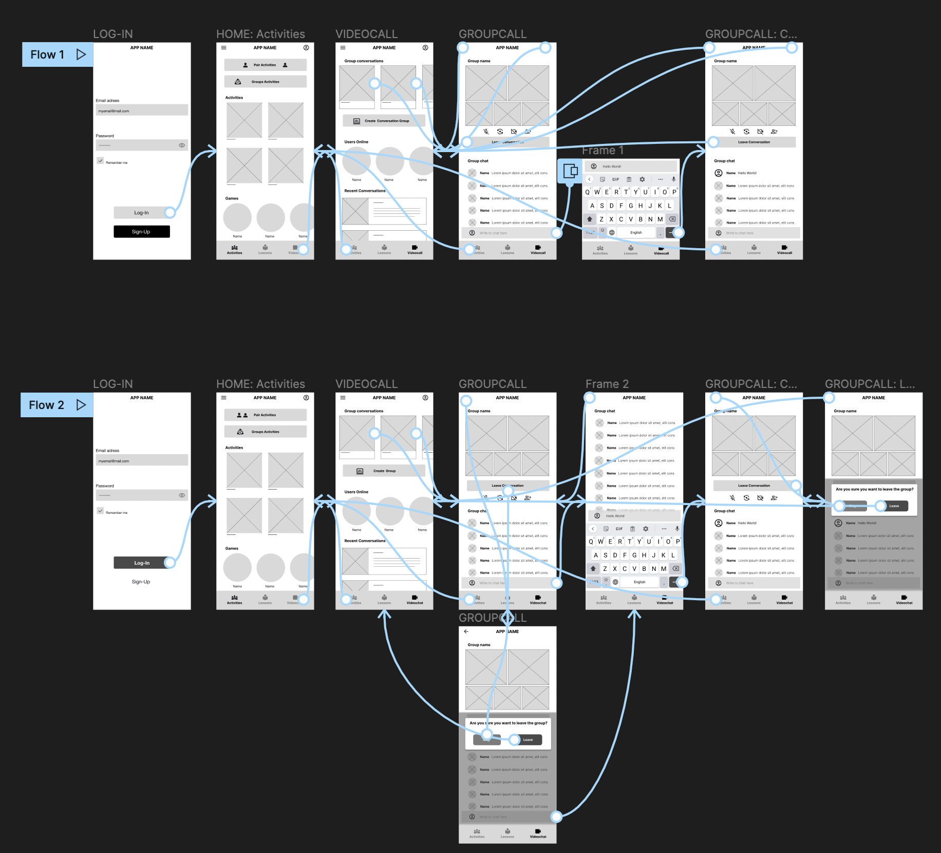
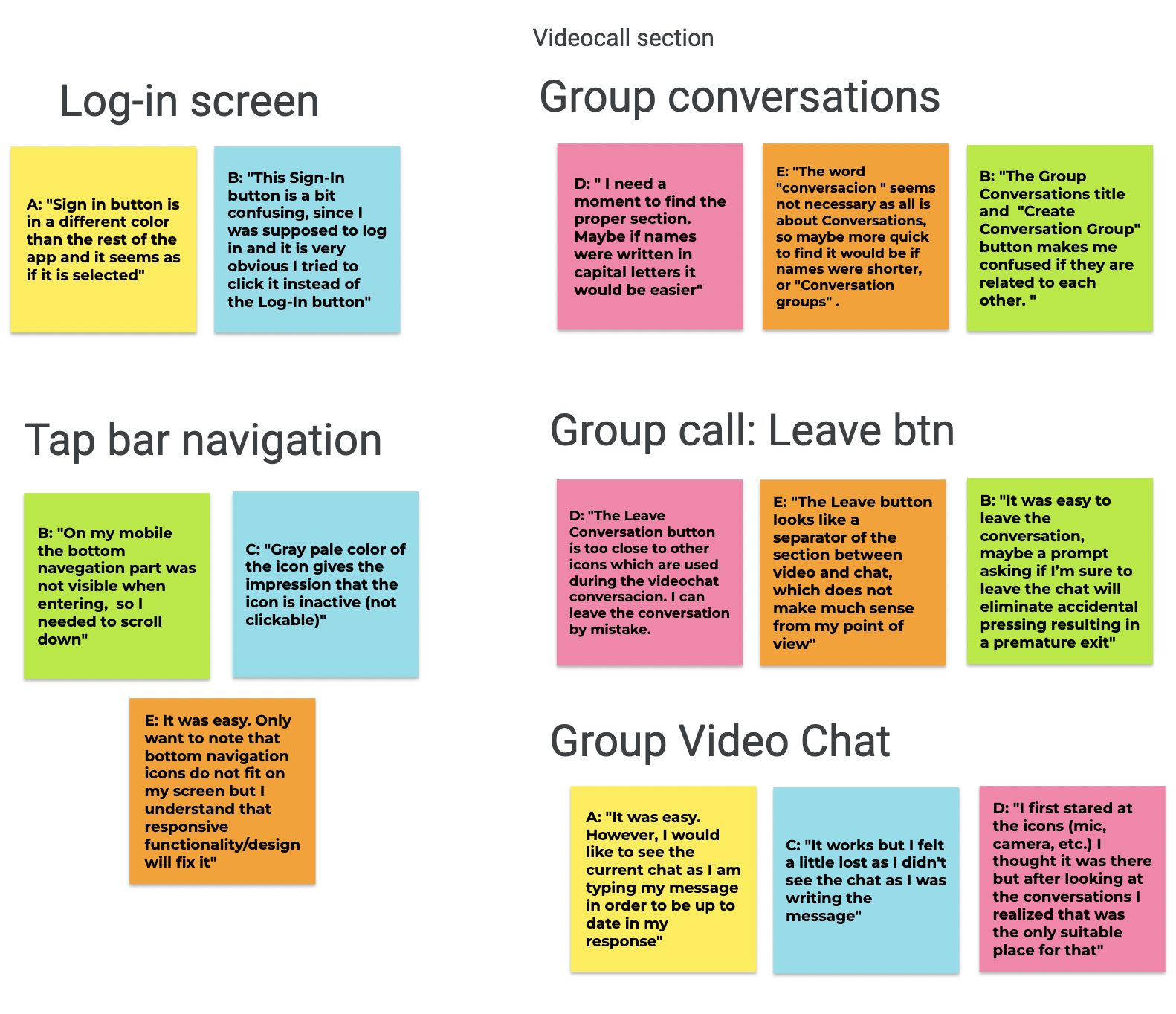
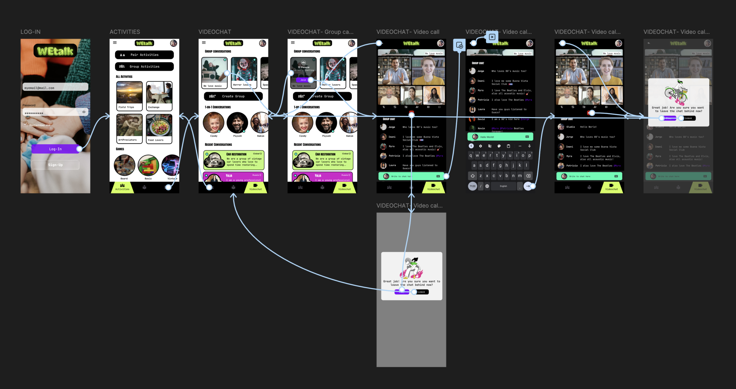
To prepare for usability testing, I created a low-fidelity prototype that connected the user flow of joining a group video chat and interacting with the group via chat. After an initial round of usability testing the low-fidelity prototype was iterated upon based on insights from the study
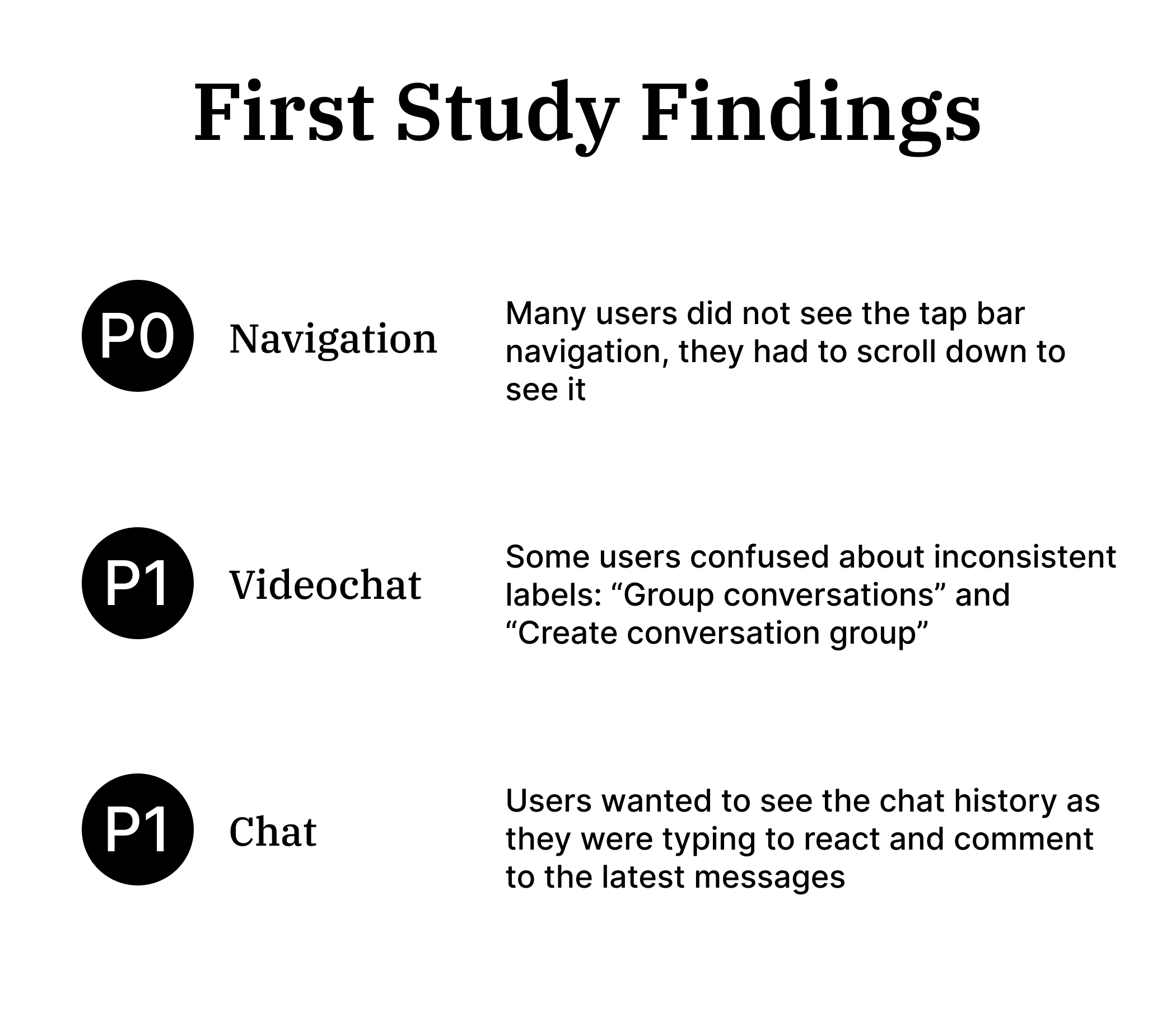
Mockups
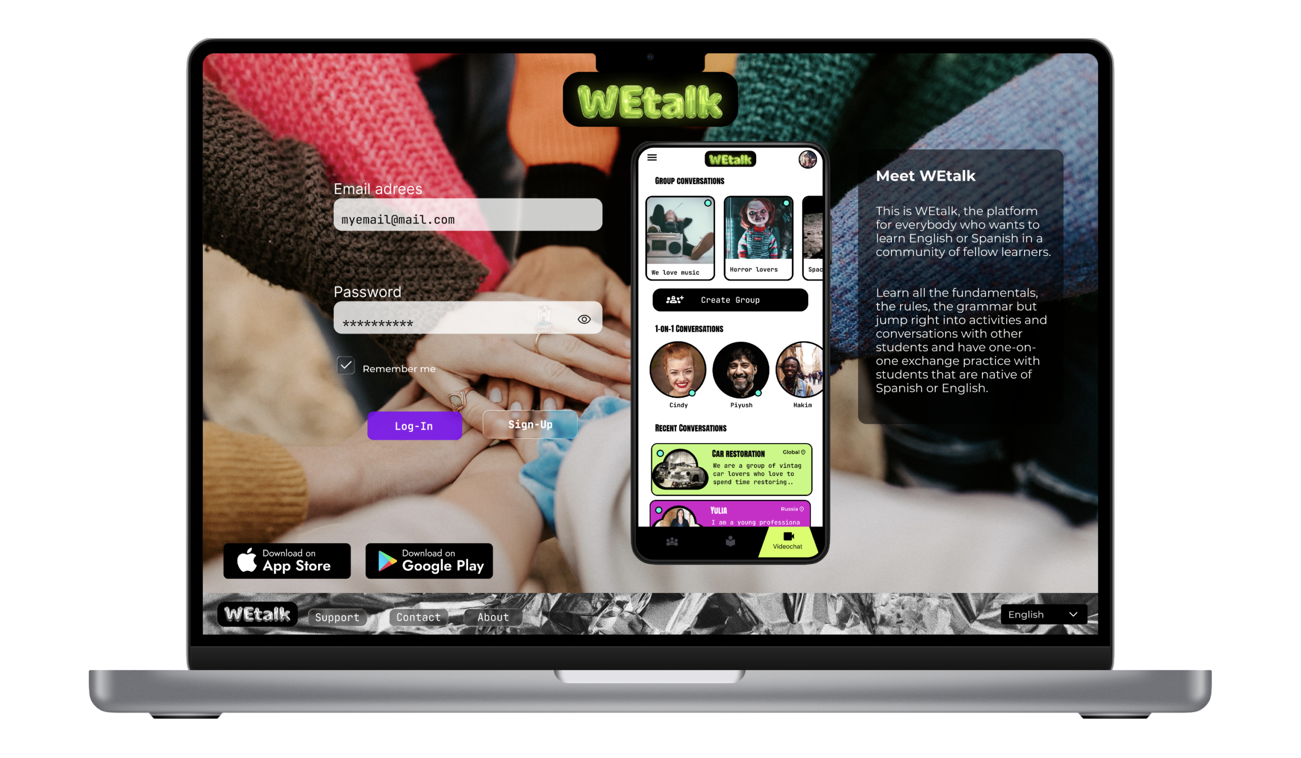
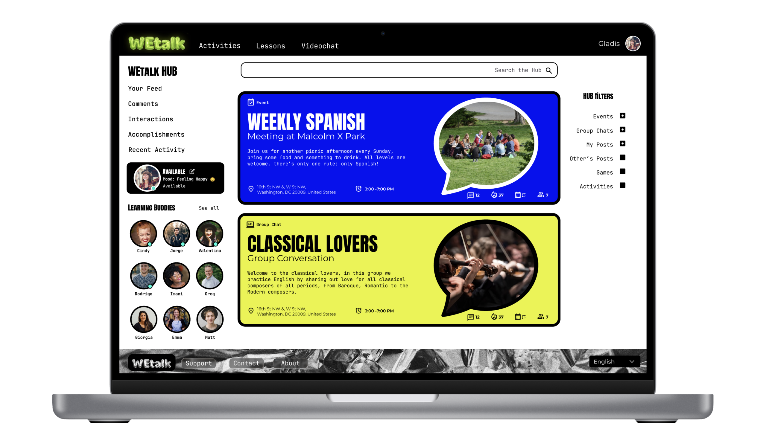
Design refinements included adding content copy and images for users to understand the purpose of the sections clearly and increasing font sizes for better legibility on all pages
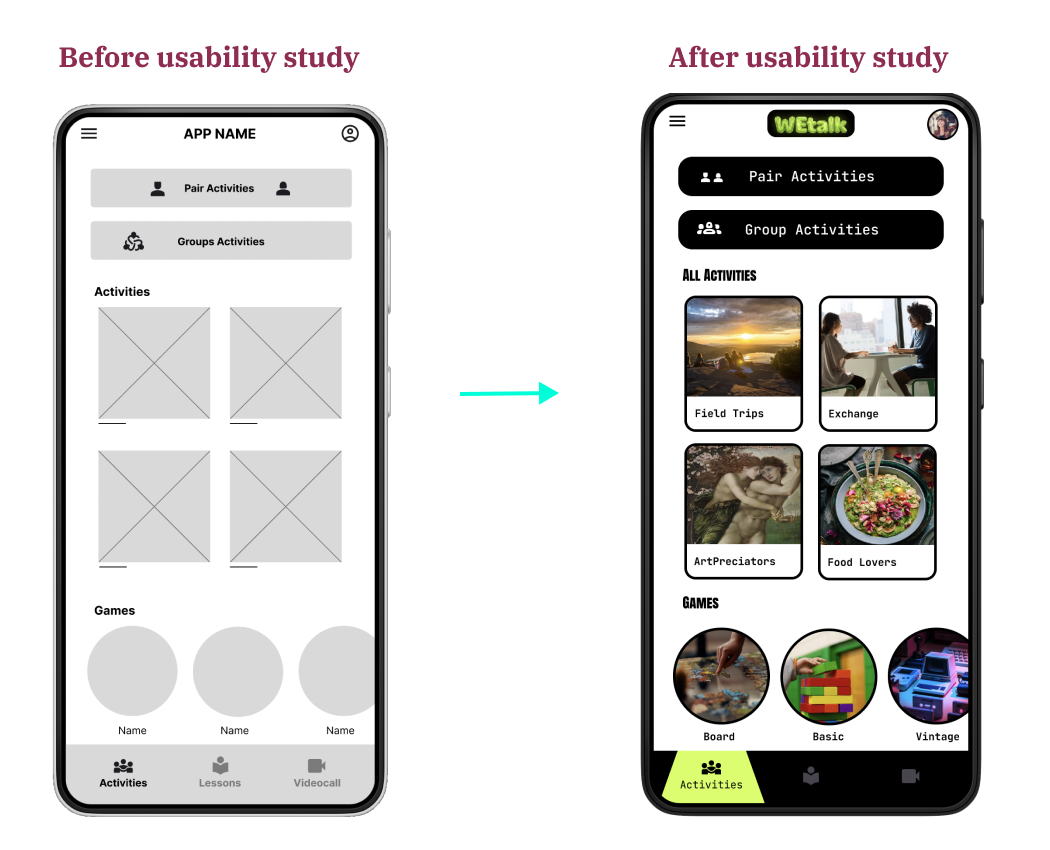
Additional design changes included adding cyan green online indicator status to conversations and users currently online including those within the recent conversations section
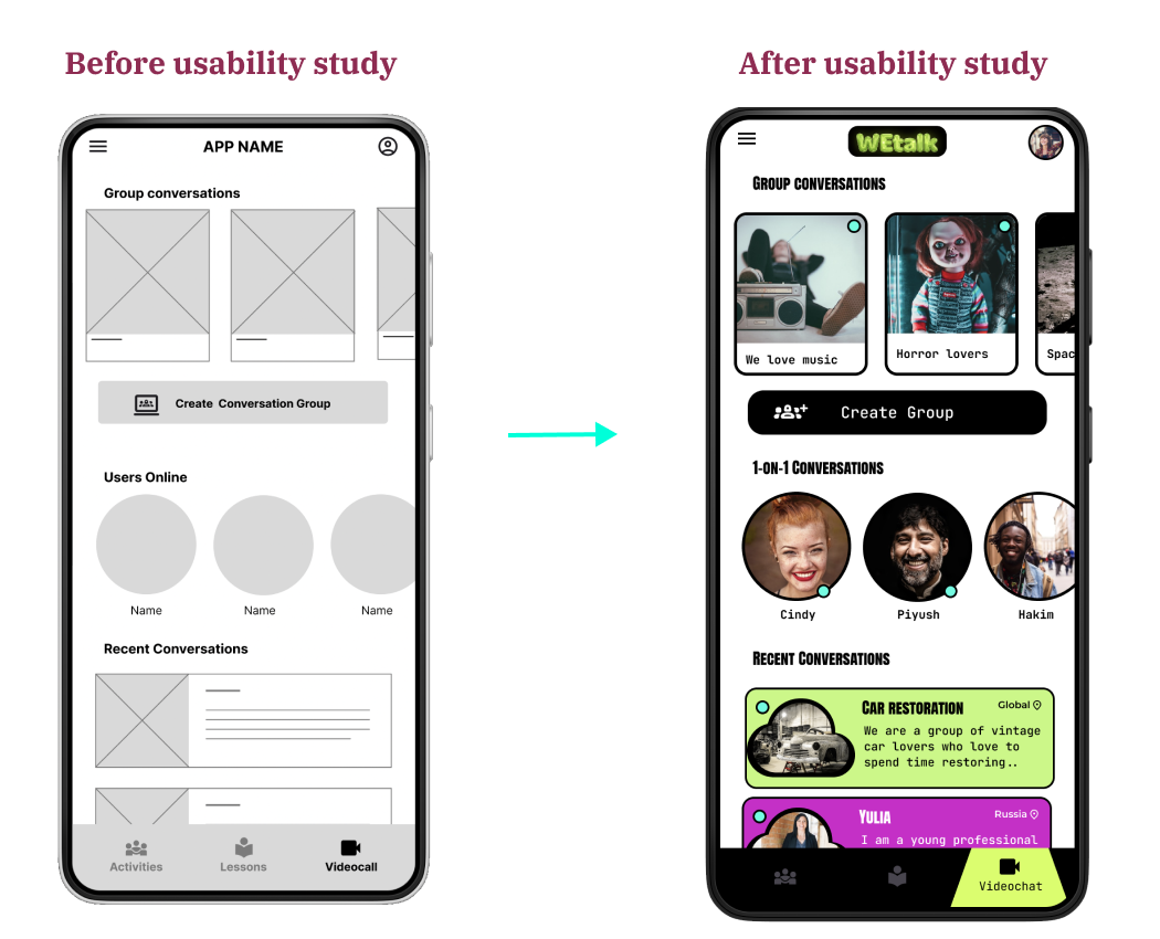
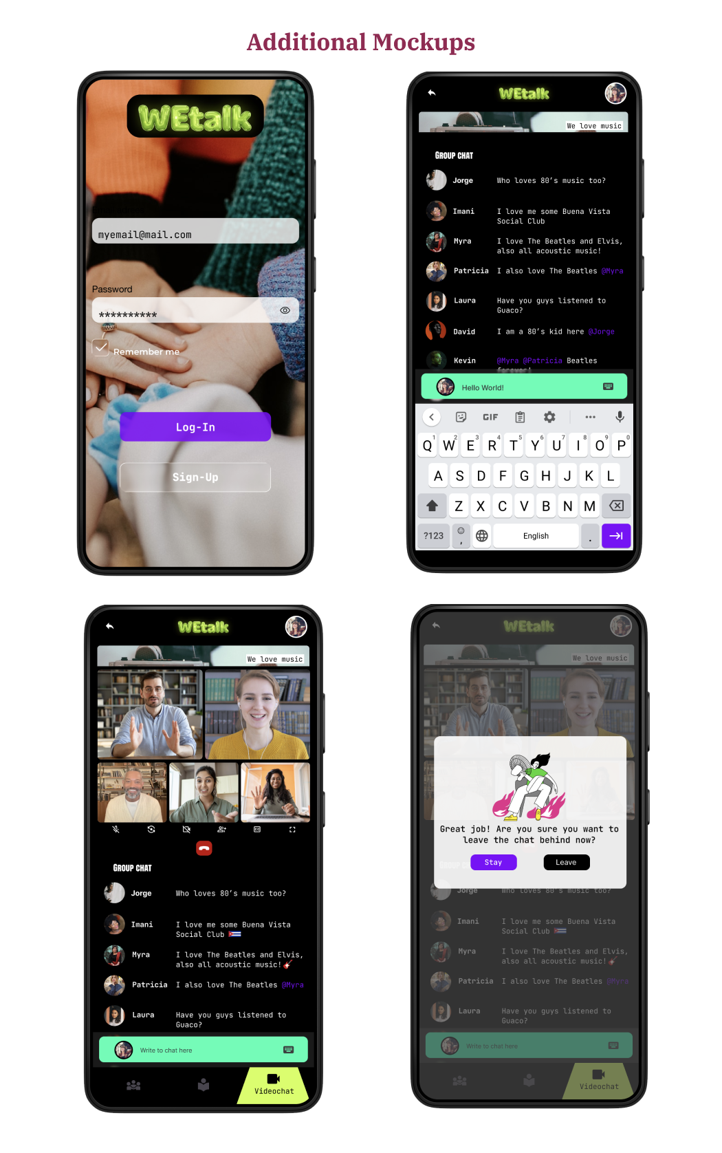
Hi-Fidelity Prototype
The high-fidelity prototype followed the same user flow as the low-fidelity prototype, including design changes made after the usability study
The tab bar features a minimal microinteraction that enhances the brand identity while focusing navigation
Group chats feature a flip card microinteraction that informs the user of number of online participants and serves as a confirmation to join the group
Responsive Design
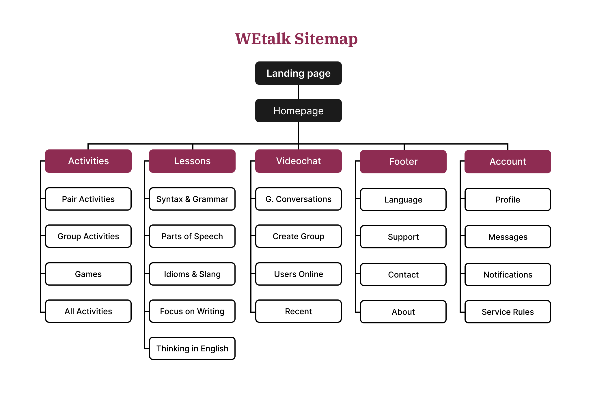
With the app designs completed, I started work on designing the responsive website. I used the WEtalk sitemap to guide the organizational structure of each screen design to ensure a cohesive and consistent experience across devices
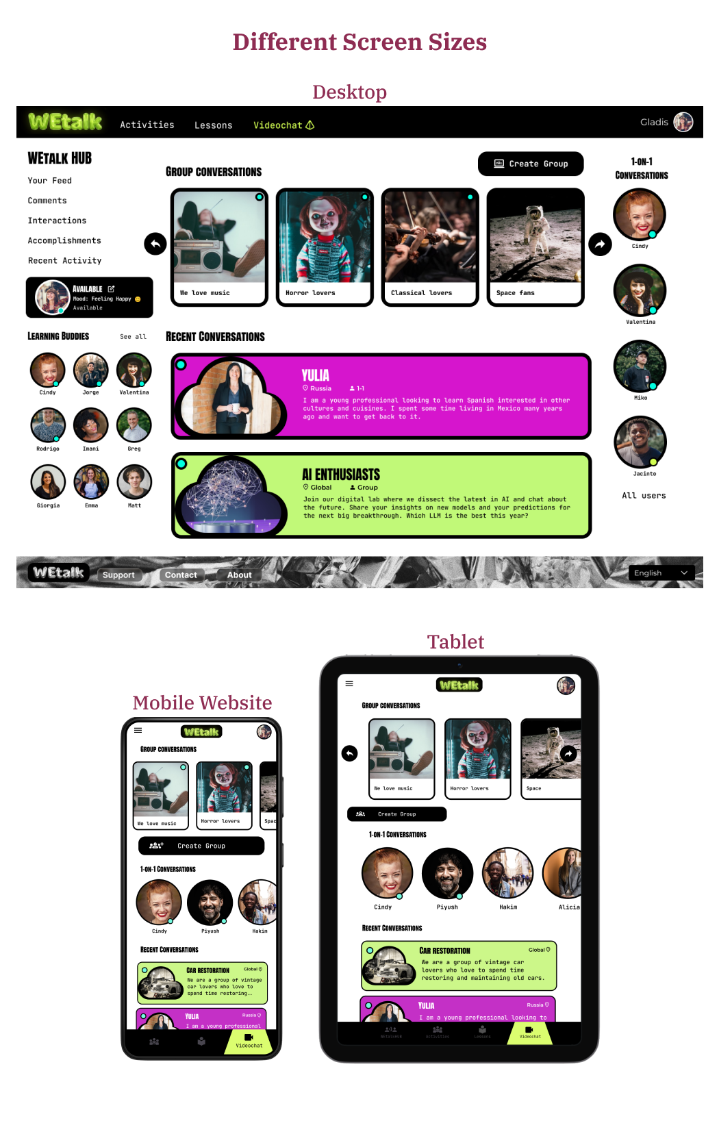
Resonsive designs for screen size variations included mobile website, tablet, and desktop. I optimized the design in each device screen size to fit specific user needs and use cases
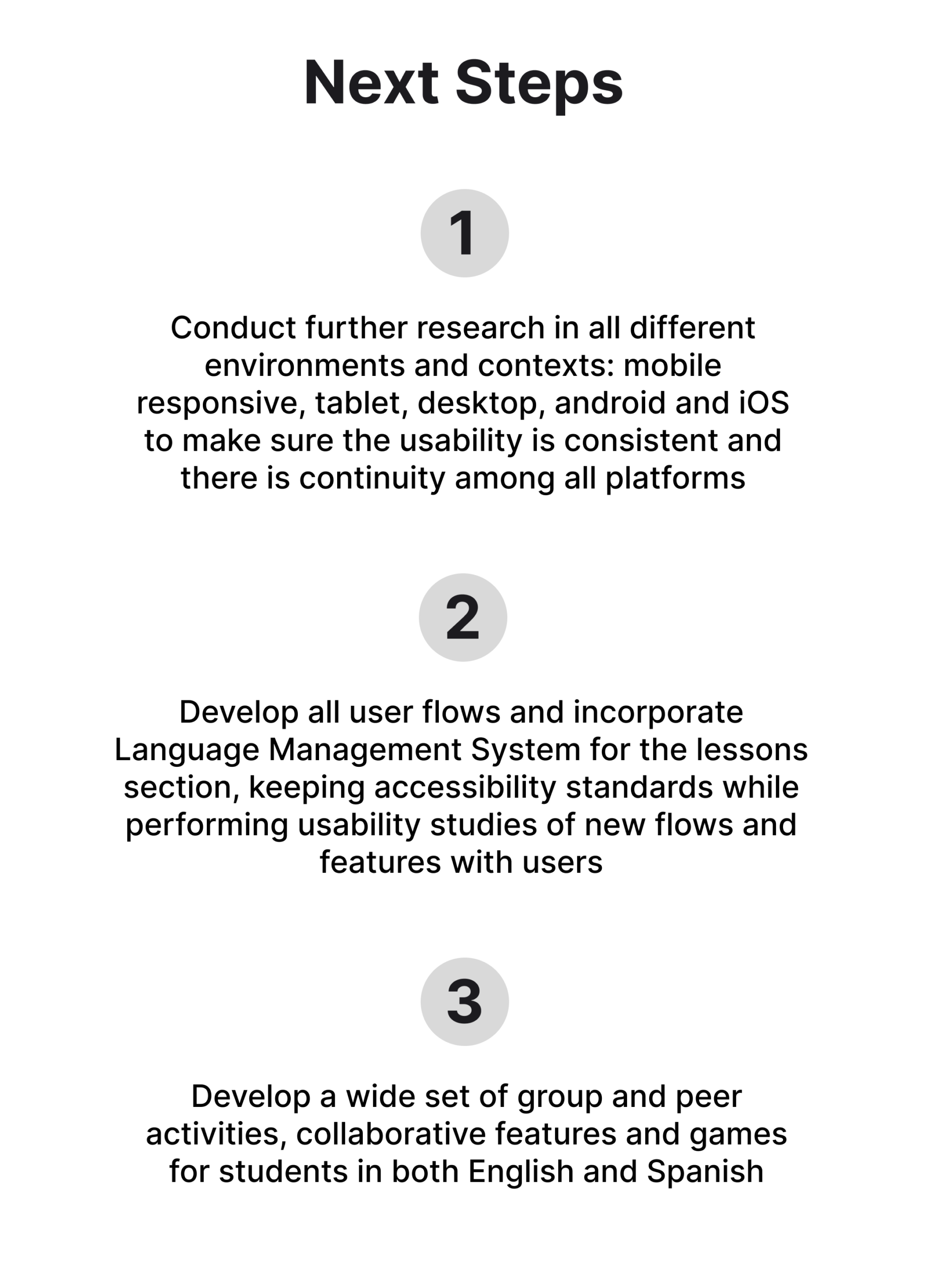
Going forward

Users shared that WEtalk provides a rich and engaging learning experience that adjusts to their language level, interests and needs while supporting their confidence in speaking practice. One usability study participant mentioned they liked the fact that they can learn grammar and rules, learn vocabulary through games and activities and even find a native speaker to practice all in one place

I learned a lot of valuable insights during the empathize phase: the diversity of challenges, motivations and characteristics of users looking to learn English and Spanish
Looking at the current available solutions and products while performing a competitive audit for this project enabled me to see how fragmented the competitors’ offerings are; this informed the ideation phase to come out with a design solution that integrated a more comprehensive set of resources, tools and lessons for students in addition to integrating a community experience of active co-learning, practice and language exchange
