Project Overview
Domus is house rental website for people looking to rent a house long term. It also provides users the ability to buy and rent a house all within the platform. Typical users are mostly working professionals and business people between the ages of 35-50. Domus goal is to simplify the process of buying or renting a house long term by integrating all the process in fewer steps, guiding and informing users in the journey while minimizing repetitive tasks
The Problem
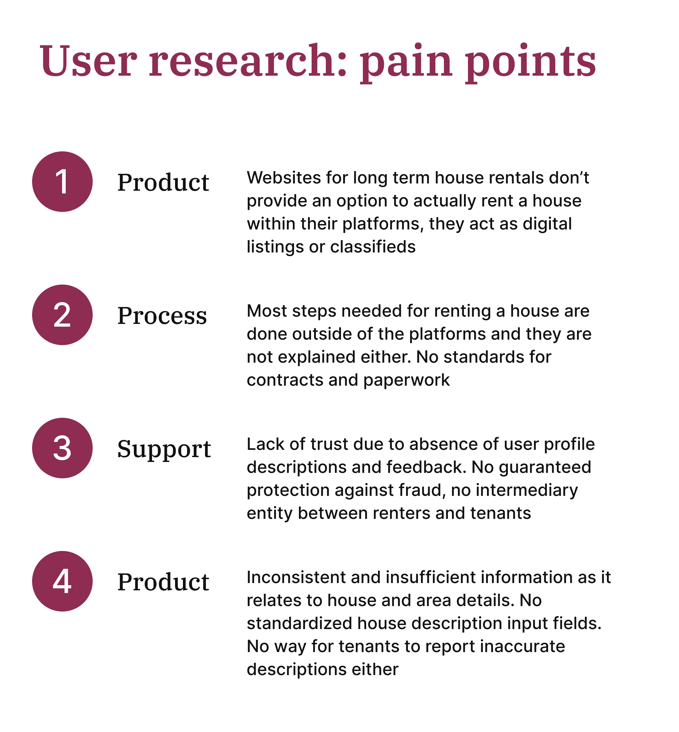
Most house rental websites work as a digital version of a newspaper classifieds section. They only contain listings and contact information, and all the rental process is done externally person to person, without an option to rent a house directly on the platform
The Goal
Create a house rental platform where people can safely rent a house long term in few simple steps without needing to spend long hours contacting renters, figuring out availability, looking up additional information outside the platform and doing lengthy paperwork processes
My Role and Responsabilities
ROLE: UX Designer doing foundational research, ideation, prototyping and usability testing
RESPOSIBLE FOR: Foundational research, conducting interviews, processing and synthetizing data, ideation, paper and digital wireframing, accounting for accessibility, prototyping responsive designs and testing prototypes with users for usability, further design iteration
Research
I conducted user interviews, which I then turned into empathy maps to better understand the target users and their needs. I discovered that many users have a difficult time using house rental platforms because of fear of being scammed
I also discovered that rental websites where users can actually rent a house long term all within the platform itself do not exist. Instead, users are left with the challenging and overwhelming task of handling all communications, checking veracity of descriptions , understanding legal contracts and researching state laws all by themselves
Users even have to decide whether to conduct background checks on other users due to the lack of proper profile pages with verification status and a user review system for renters and tenants
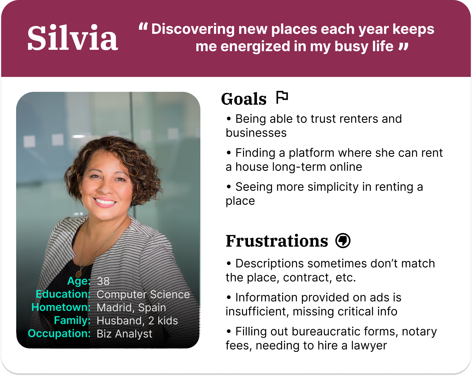
Personas
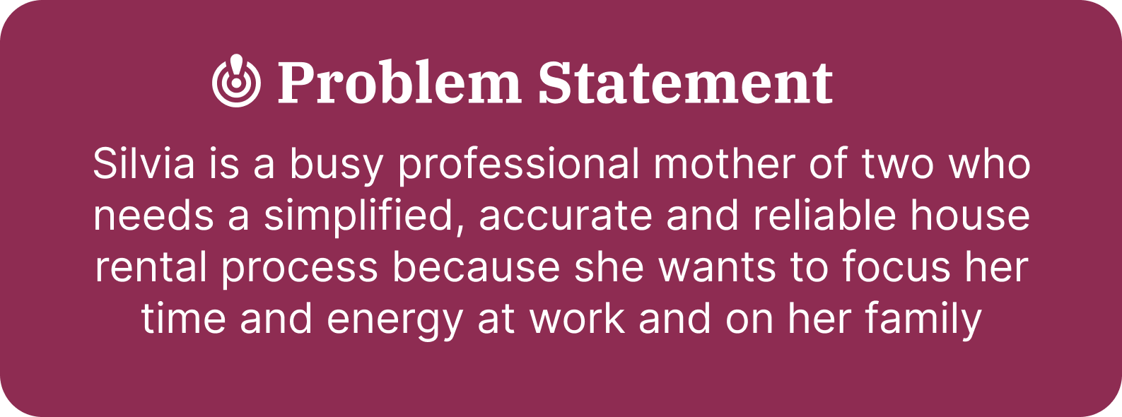
One main user group was identified through the initial research with a common set of charactheristics. One persona was created to represent this user group at the project’s start to continue the empathizing process
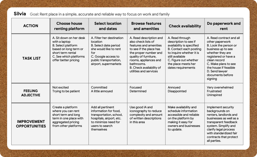
User journey map
I created a user journey map of Silvia’s experience using the competitor’s site to help identify possible pain points and improvement opportunities to implement in my own design
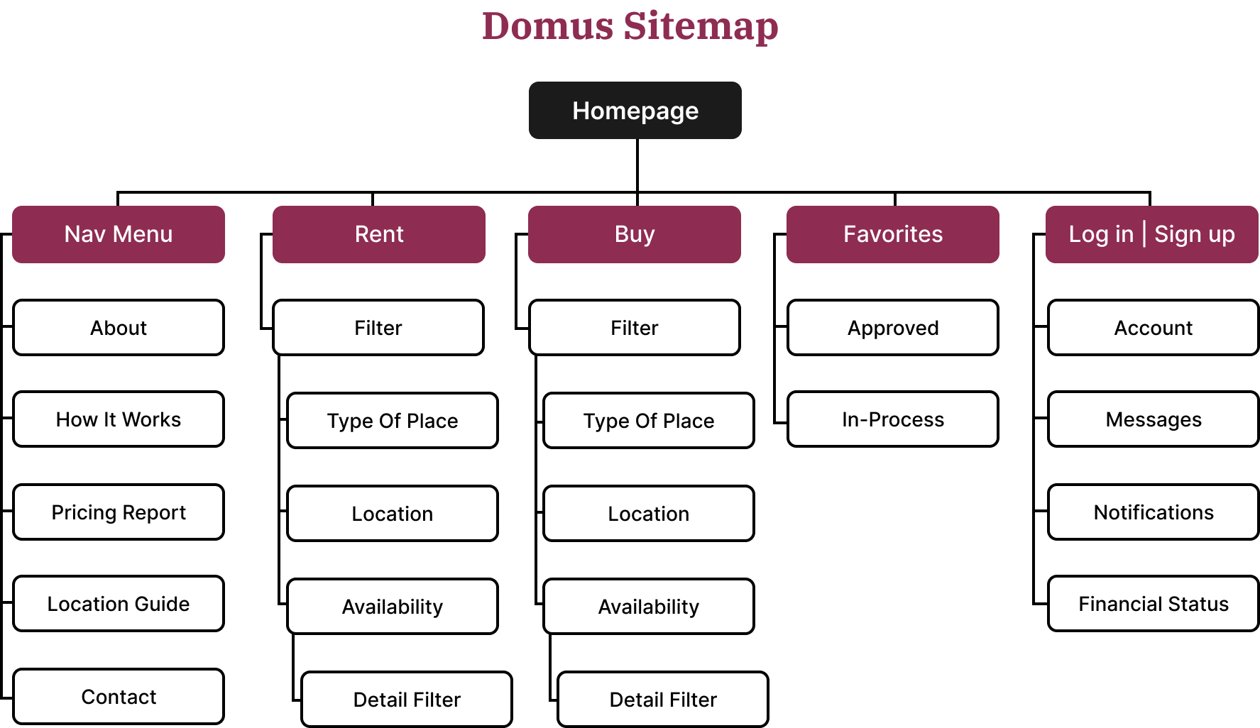
Sitemap
The sitemap was kept simple with minimizing complexity. The goal was to make the website intuitive while reducing cognitive overload, making only pertinent and important information available within the pages that required them, directing users through the rental process in fewer steps
The information architecture is implemented in a familiar website design pattern, then evolving into a sequential pattern during the rental process
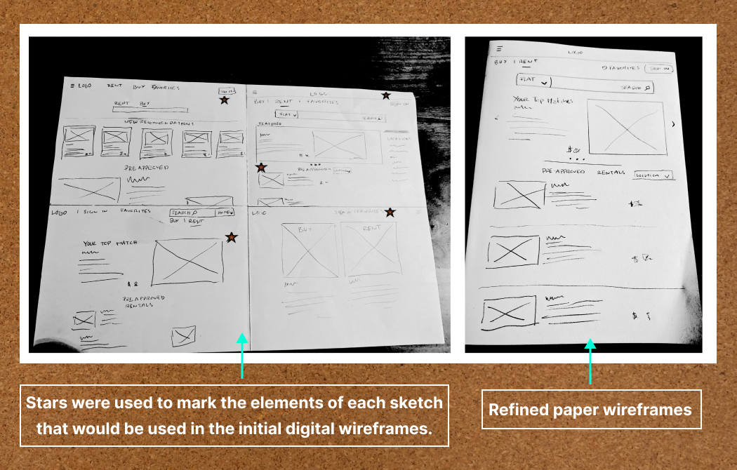
Paper wireframes
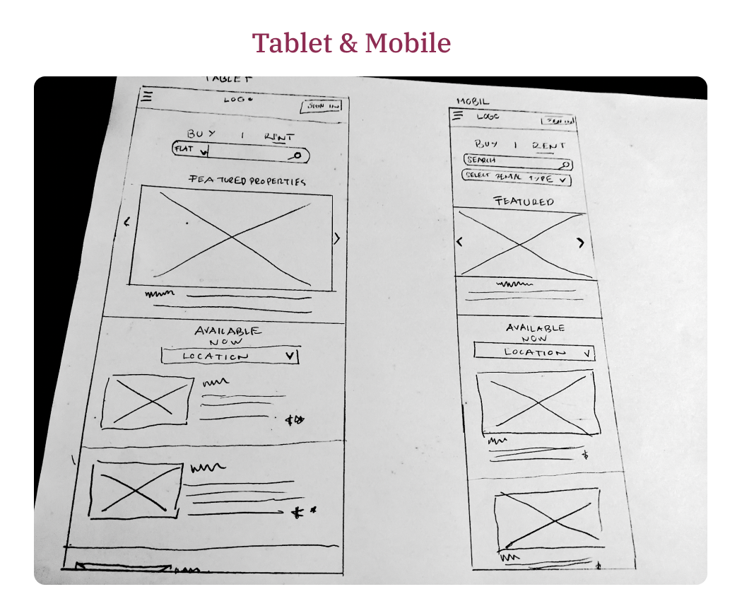
I sketched out paper wireframes for each screen in my responsive website, keeping my persona’s pain points in mind: trust, accurate descriptions, lengthy processes and paperwork for renting a house
The home screen paper wireframe variations to the right focus on optimizing the browsing experience for users
Screen size variations
Digital wireframes
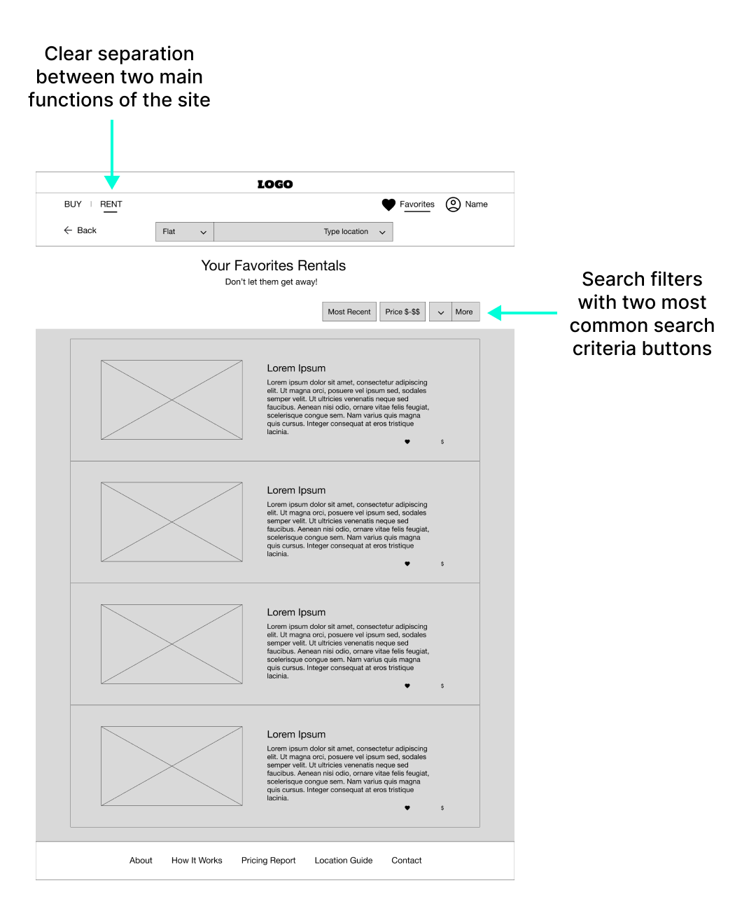
Moving from paper to digital wireframes made it easy to understand how the design could help address user pain points and improve the user experience
Digital wireframe screen size variations
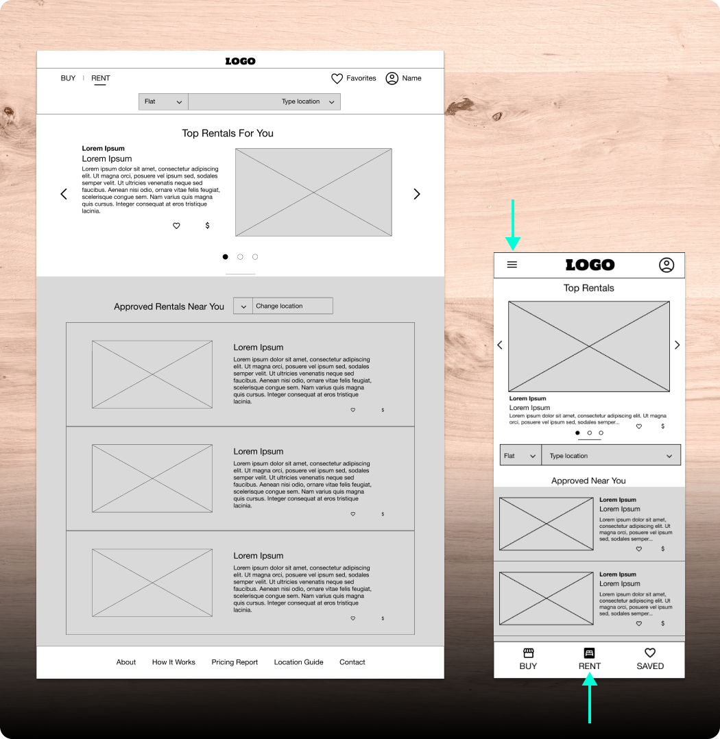
On the right: mobile responsive version of the rent page where the three main desktop sections where implemented with a tab navigation bar. A filled icon indicates location status, all icons display corresponding text labels. Footer items, including language selector and other functionality are tucked away inside the hamburger menu
Low-fidelity prototype
I connected all screens involved in one user flow: renting a house process from a listing saved to favorites
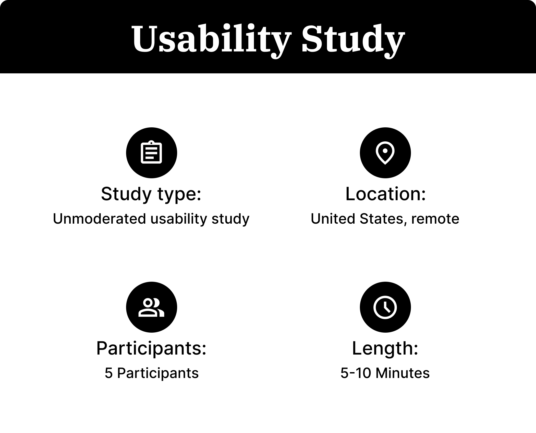
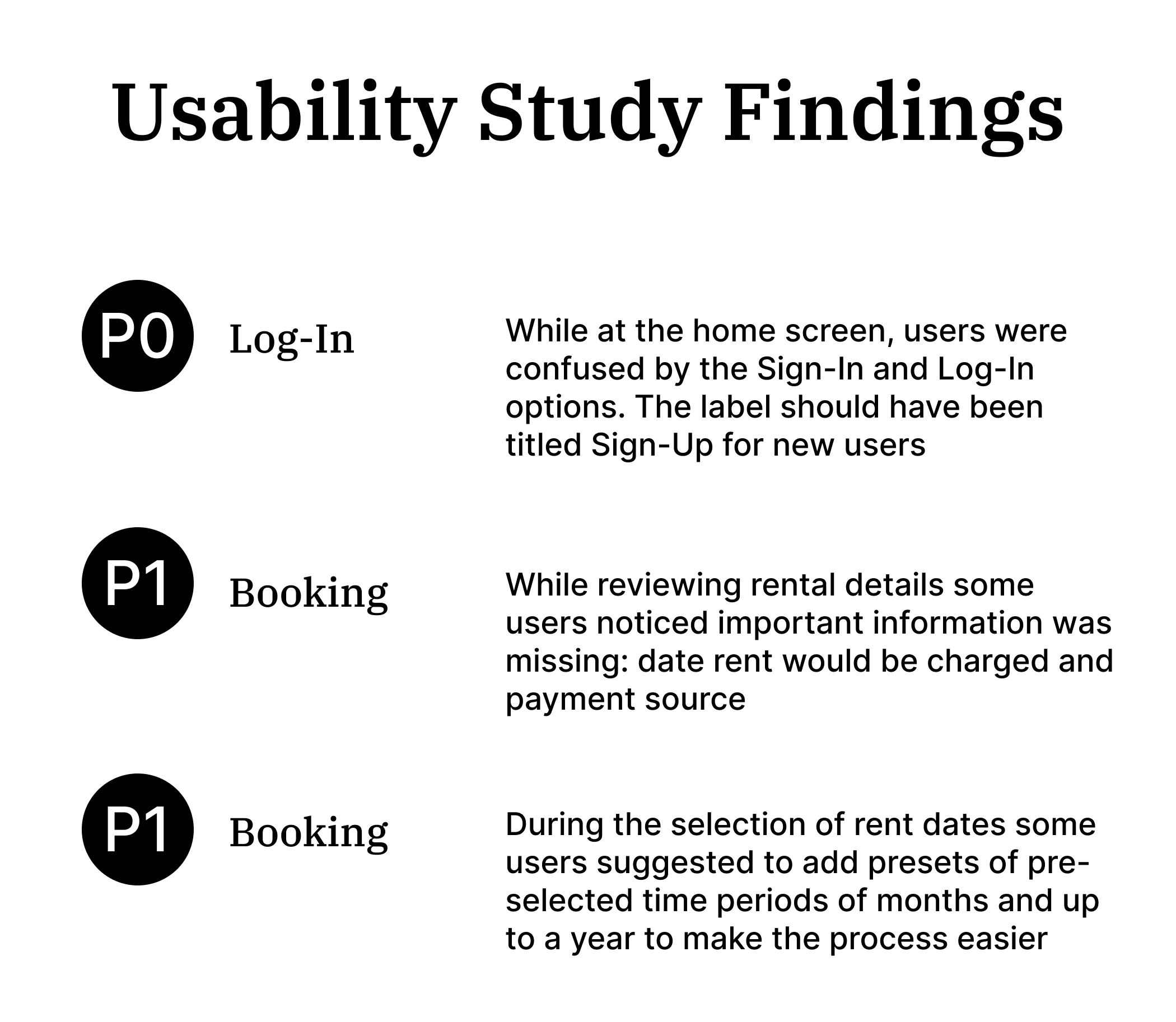
I received feedback on my prototype from the first usability study which included pain points regarding time range options for the date picker while booking and important information missing within the order details summary. This feedback was implemented on a second iteration of the low-fidelity prototype

Mockups
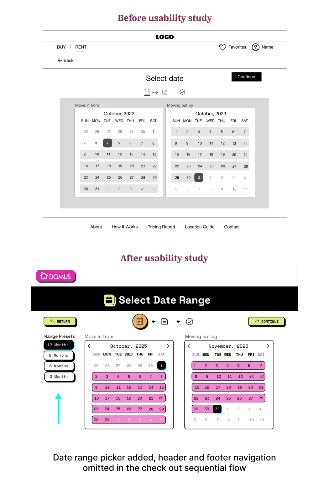
Based on the insights from the usability study, I made changes to the first phase of the booking process- selecting a move in and move out date range. By adding presets of most common time periods many users save time, making the experience faster, more usable and enjoyable
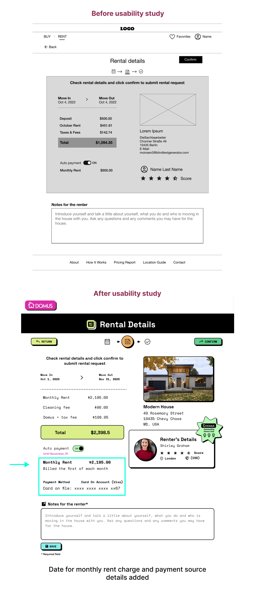
Another insight from the usability study informed the design decision to add critical billing information that was missing: date of auto payment charge and payment source
The Smart Lease Match & Predictor
The Strategy
To bridge the “long-term rental gap” identified in my research, I integrated Predictive AI to transform Domus from a passive search tool into an active financial mediator. This feature addresses two major pain points: financial uncertainty for tenants and reliability concerns for landlords.
Feature Breakdown: The Renter Dashboard
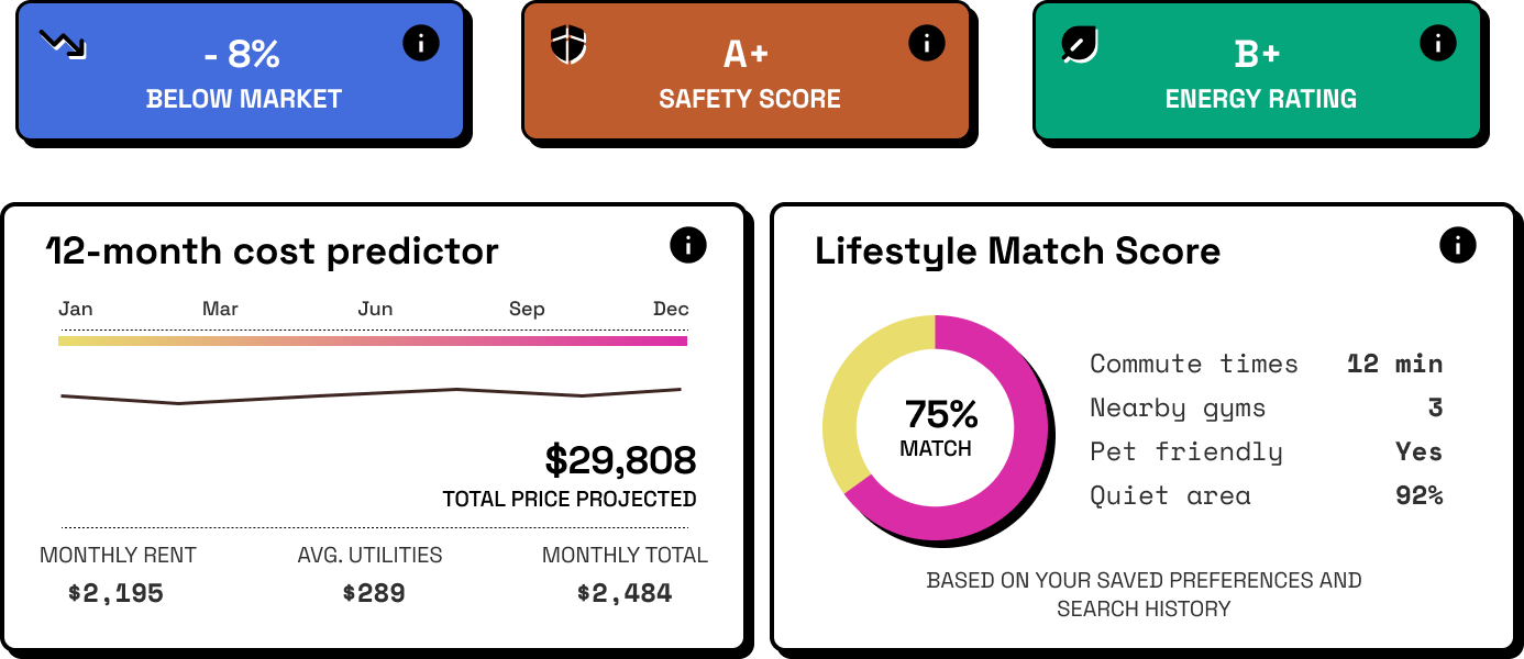
The Renter Dashboard focuses on Financial Stability & Lifestyle Fit, turning a standard listing into a personalized 12-month financial roadmap.
12-Month Total Cost Predictor: The Design: A line graph comparing “Baseline Rent” against “Predicted Total Costs.”
The Tech: This leverages Time-Series Forecasting to analyze historical building consumption and seasonal utility fluctuations. It solves the user’s fear of “hidden costs” by providing a realistic budget forecast.
Lifestyle Resilience Score: The Design: A circular “75% Fit” gauge.
Powered by Collaborative Filtering (similar to recommendation engines like Netflix), this score matches properties based on “lifestyle trajectory” data—such as proximity to job hubs and preferred amenities—rather than just basic filters.
Business Value & IPO Readiness
Integrating this AI layer significantly increases the company’s valuation:
- Reduced Churn (LTV): Better matches lead to longer lease renewals, increasing the Lifetime Value of each user.
- Proprietary Data Moat: As the AI learns, it creates unique market insights that serve as a competitive advantage and a high-value asset for potential acquisition or IPO.
- Operational Efficiency: Automating the “trust” factor through predictive reliability reduces the need for manual vetting, allowing the platform to scale globally with minimal overhead.

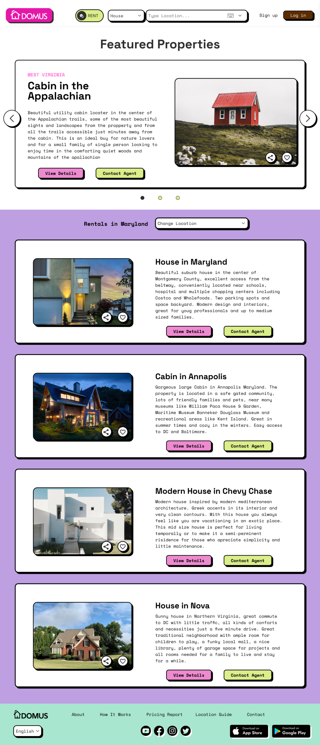
Mockups: Screen size variations
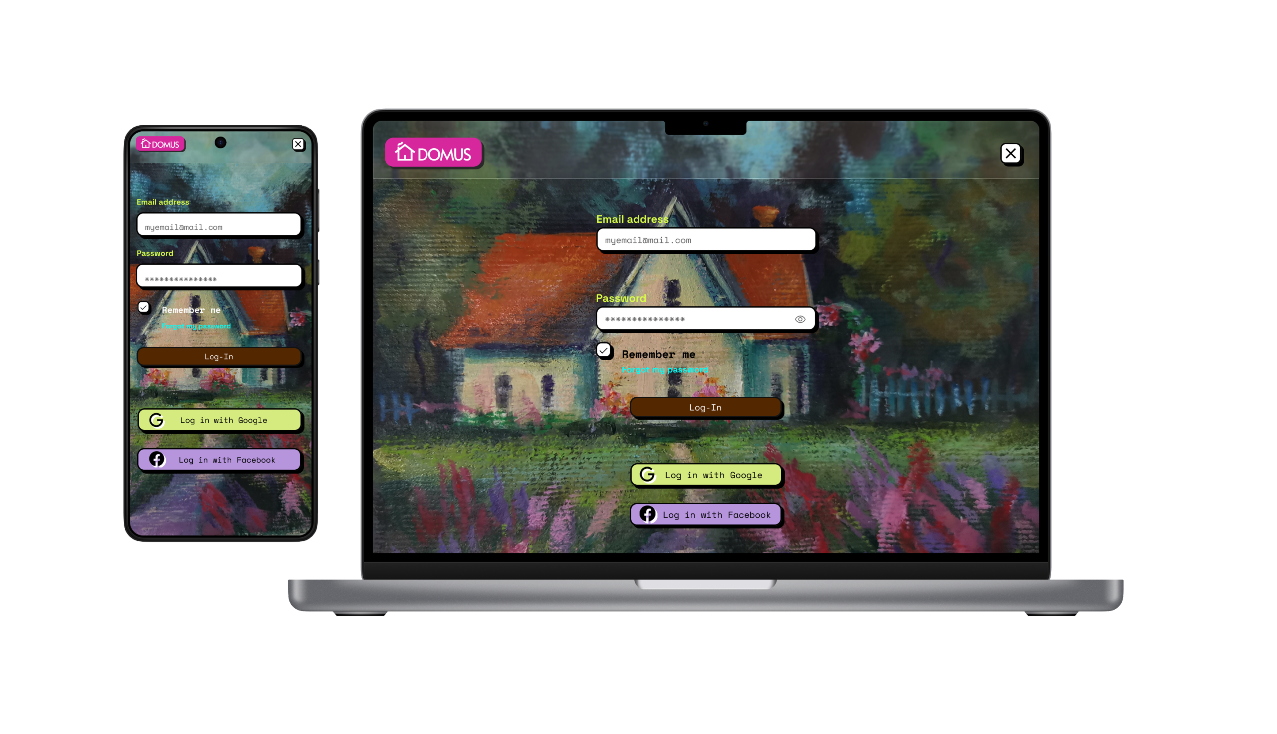
I included considerations for additional screen sizes in my mockups based on earlier wireframes. Because users access the website through a variety of devices, I felt it was important to optimize the browsing experience for a range of device sizes so users have the smoothest experience possible
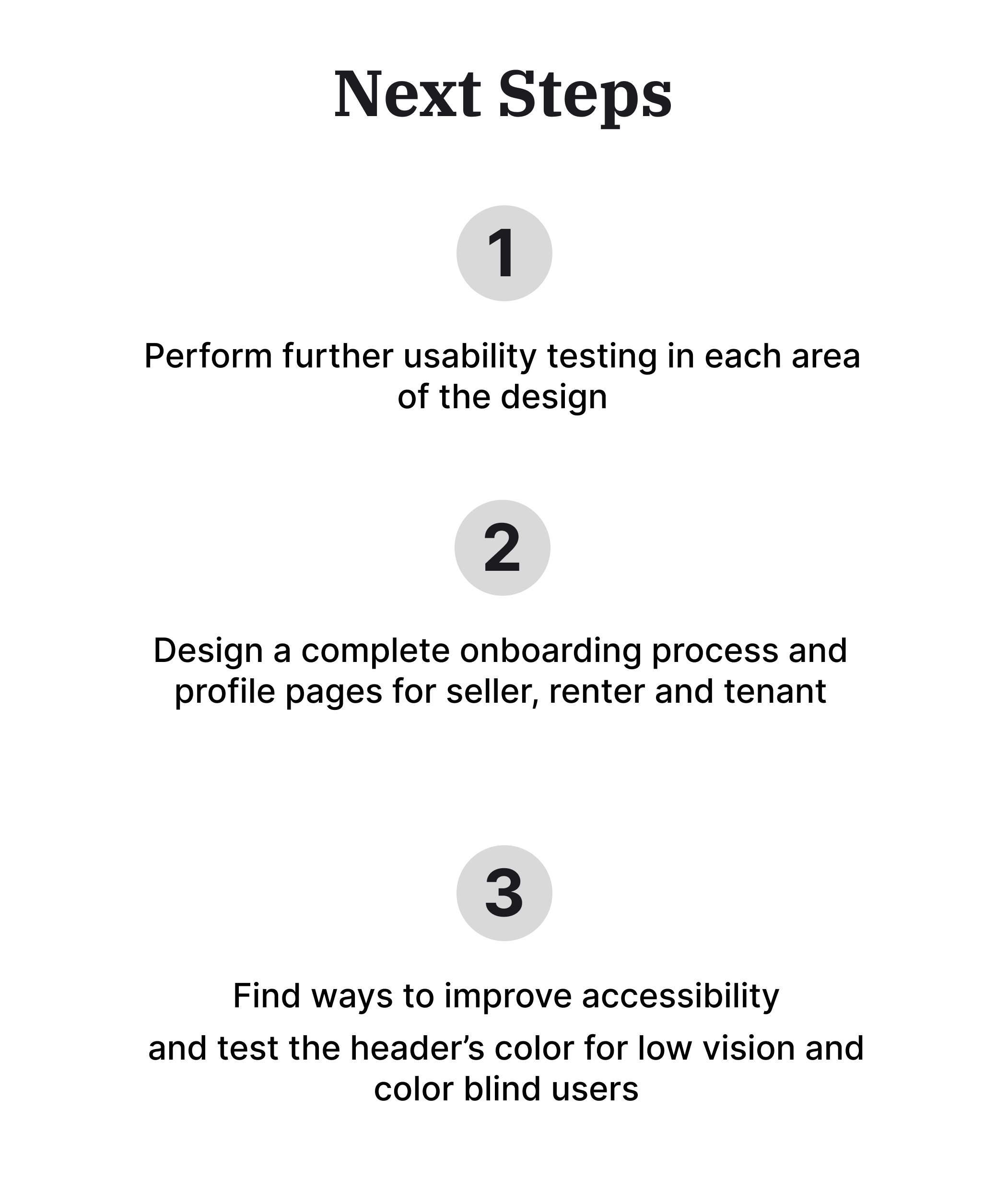
Going forward

Our target users shared that the design was intuitive to navigate and important information was accessible and easy to understand. This was possible designing with clear visual hierarchy and implementing good IA

I learned through foundational research that existing house rental websites do not provide an option for renting long term within their platform, with the exception of short term rental platforms, everything is handle outside by users
Most pain points uncovered during research and usability studies are tied to this outstanding gap in the long term rental market, and they were in the form of process, payment and support. These insights guided my design decisions: creating a platform that acts as a mediator, not just as a house advertisement hub, providing financial and account support features to attempt to support users and fill this void in the market
