Project overview
The Product
Affinity Payroll is a HR tool designed for startups and small businesses. Affinity’s goal is to make the payroll process more accessible and enjoyable for companies with limited human resources departments
The Problem
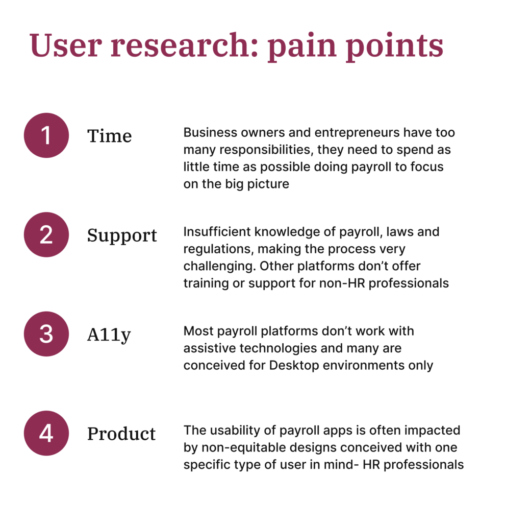
Many startup entrepreneurs and small businesses owners lack a dedicated human resources professional and must resort to performing payroll duties on their own
The Goal
Design an app that guides and teaches the process of performing payroll to small business owners and entrepreneurs with limited time and knowledge
My Role and Responsabilities
ROLE: UX designer responsible for the entire product development life cycle
RESPOSIBLE FOR: Foundational research, competitive audit, paper and digital wireframing, low and high-fidelity prototyping, conducting usability studies, accounting for accessibility, and iterating on designs
Research
I conducted interviews and created empathy maps to understand the users I’m designing for and their needs. A primary user group identified through research was small business owners and entrepreneurs
This user group provided a better understanding of one key challenge for small businesses and startups – insufficient time and resources. In essence, people within a small business or startup wear many hats and fullfil many roles
Additionally, there is often non-existent technical knowledge and experience with common payroll tasks, requirements and responsibilities, requiring even more additional time and resources for research and professional development activities
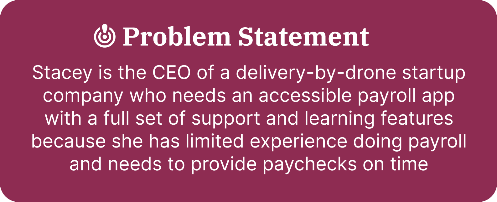
Personas
User journey map
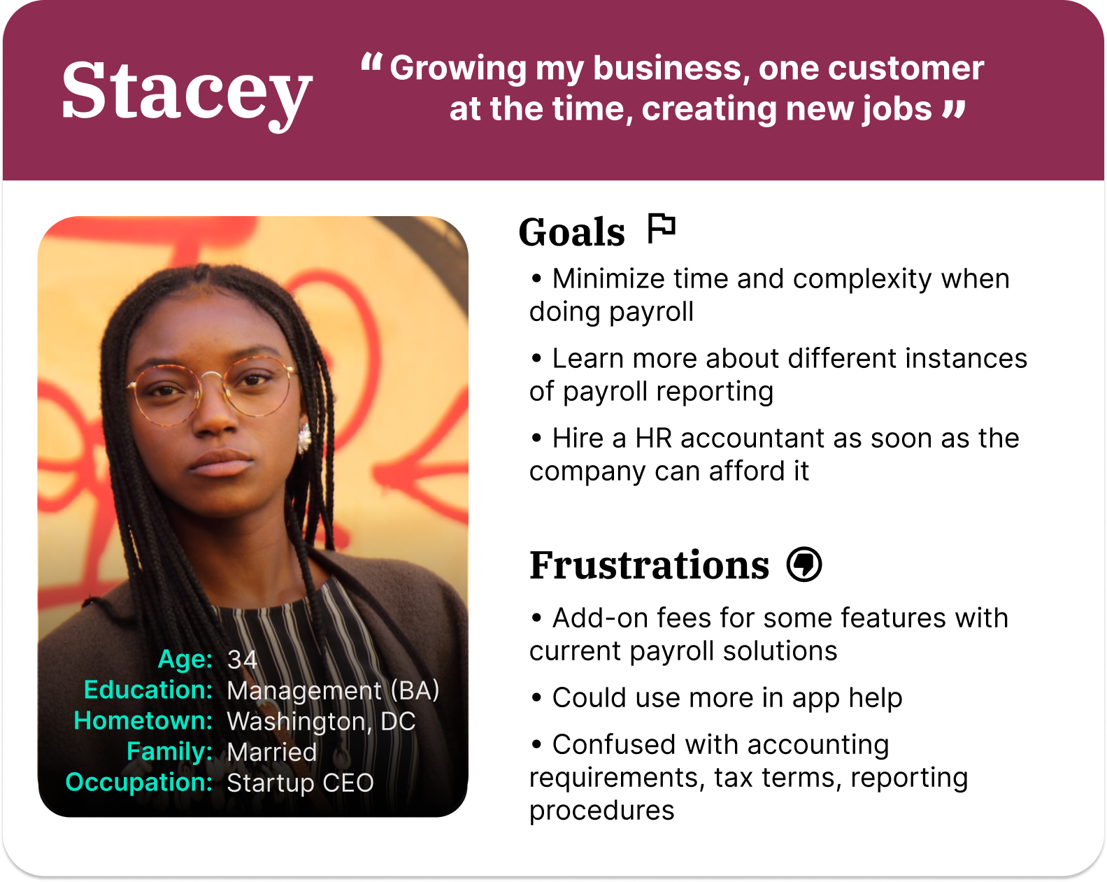
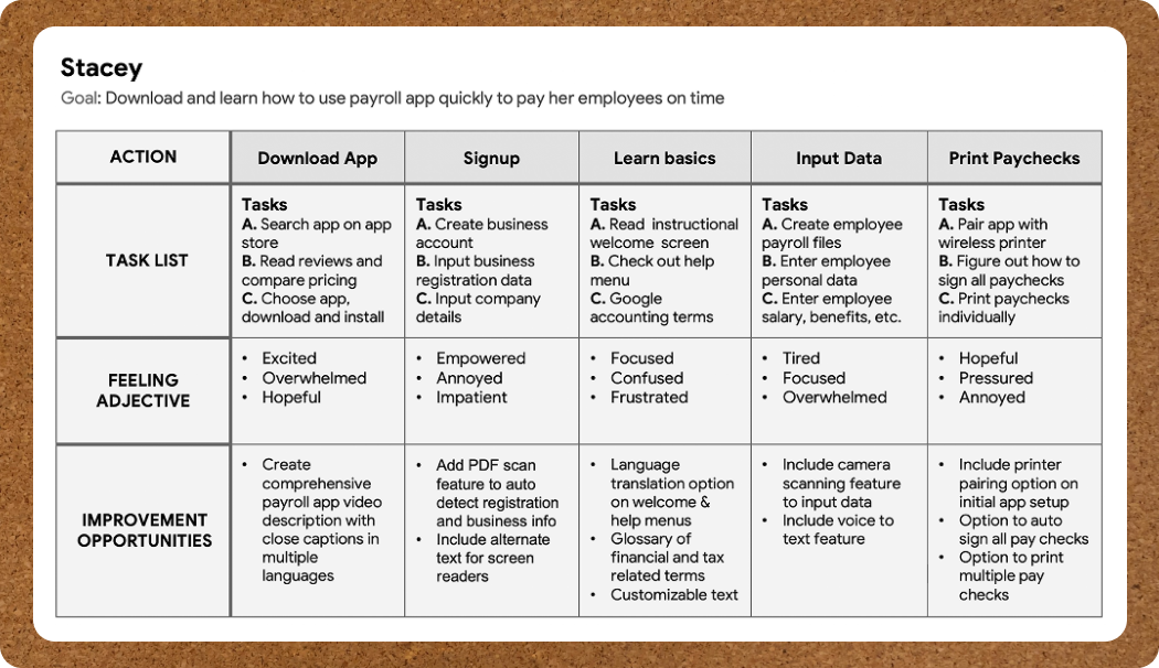
Mapping Stacey’s user journey revealed how helpful it would be for users like her to have a dedicated library to learn payroll concepts and processes built right inside the app
Paper wireframes
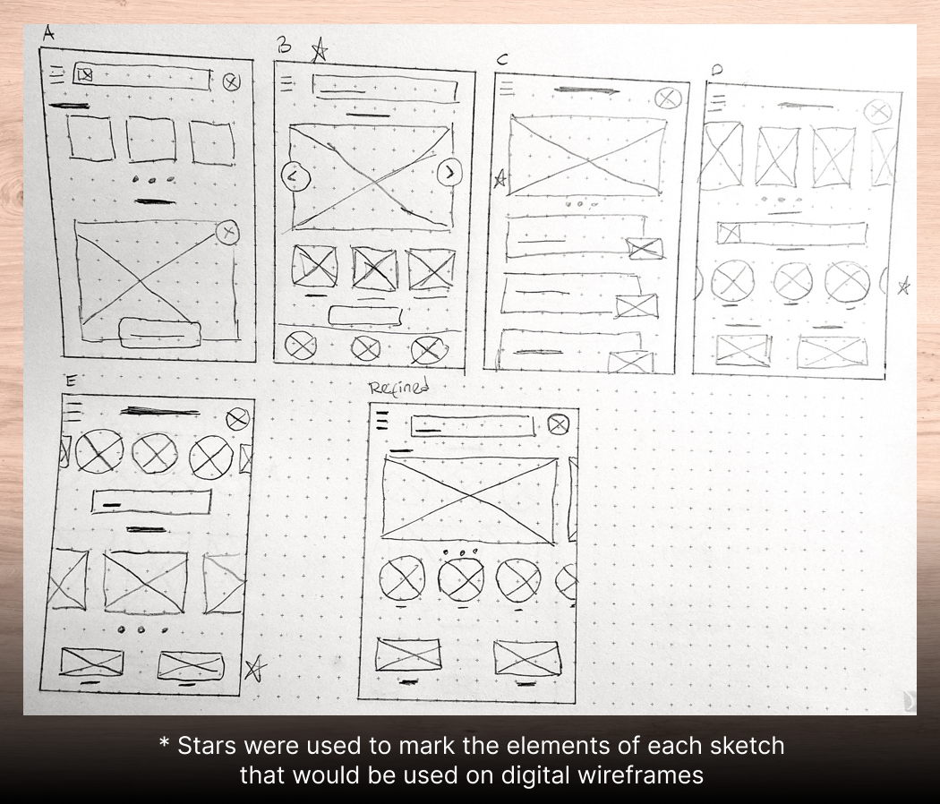
I drew five iterations of wireframes for each screen of the app on paper and selected the most optimal design patterns for addressing the main user pain points. For the home screen, I prioritized an accessible information architecture with a focus on the most important tasks and easy navigation toward learning resources
Digital wireframes
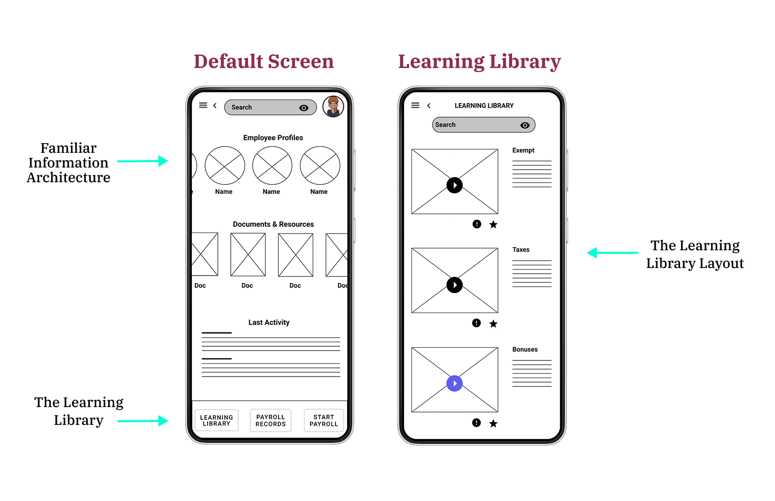
As I transitioned from paper to digital wireframes I was careful to keep the user front and center by designing a solution that would address all the user’s main pain points through intuitive Infornation Architecture, common workflow and quick access to support learning material
Low-fidelity prototype
In this prototype of the learning library user flow I tried to remove any complexity by making it as intuitive and as easy to navigate as possible, minimizing the number of screens required to complete the tasks. A quiz for each lesson was included at the end to test whether the user grasped the concepts

Usability Study
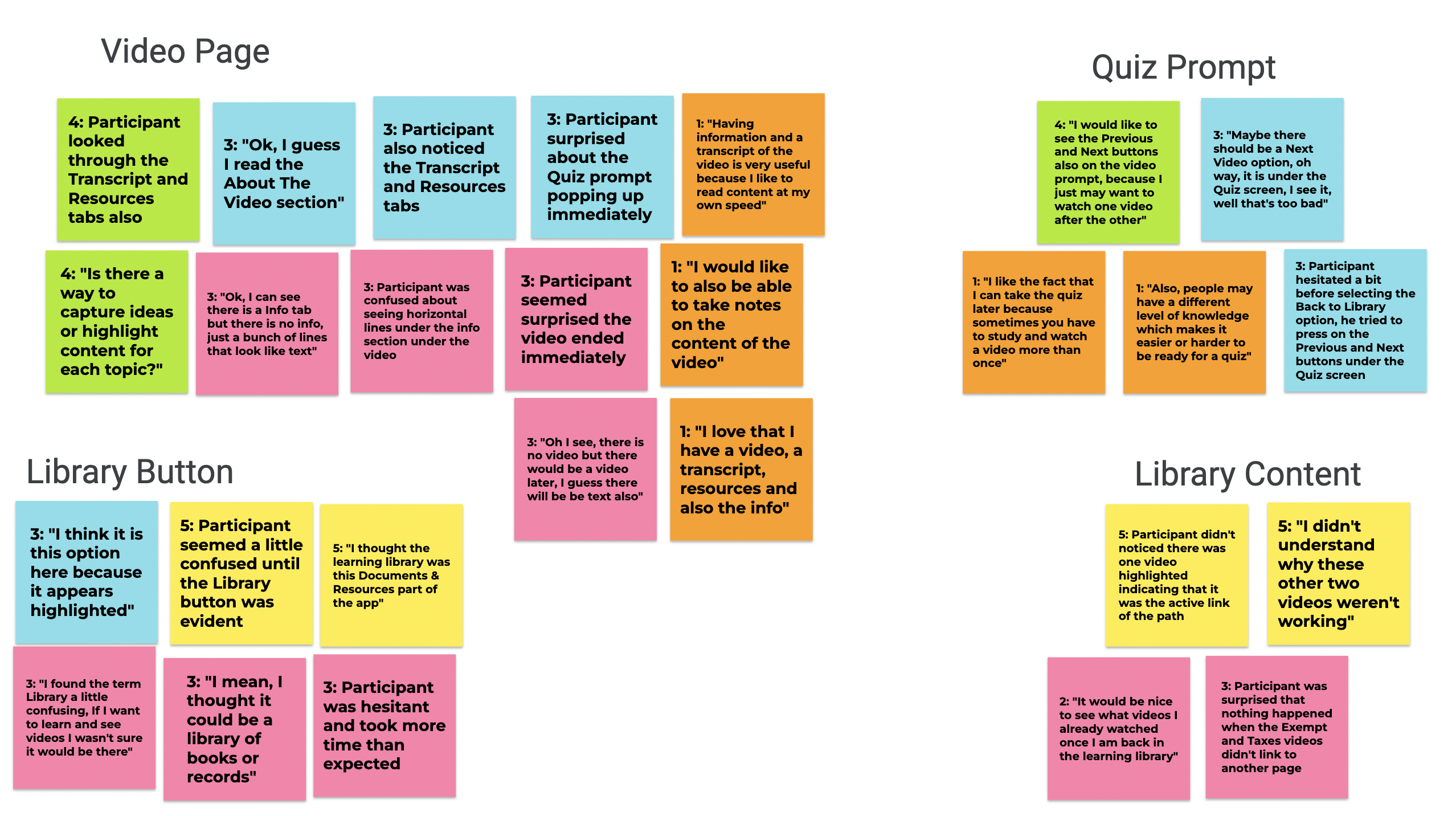
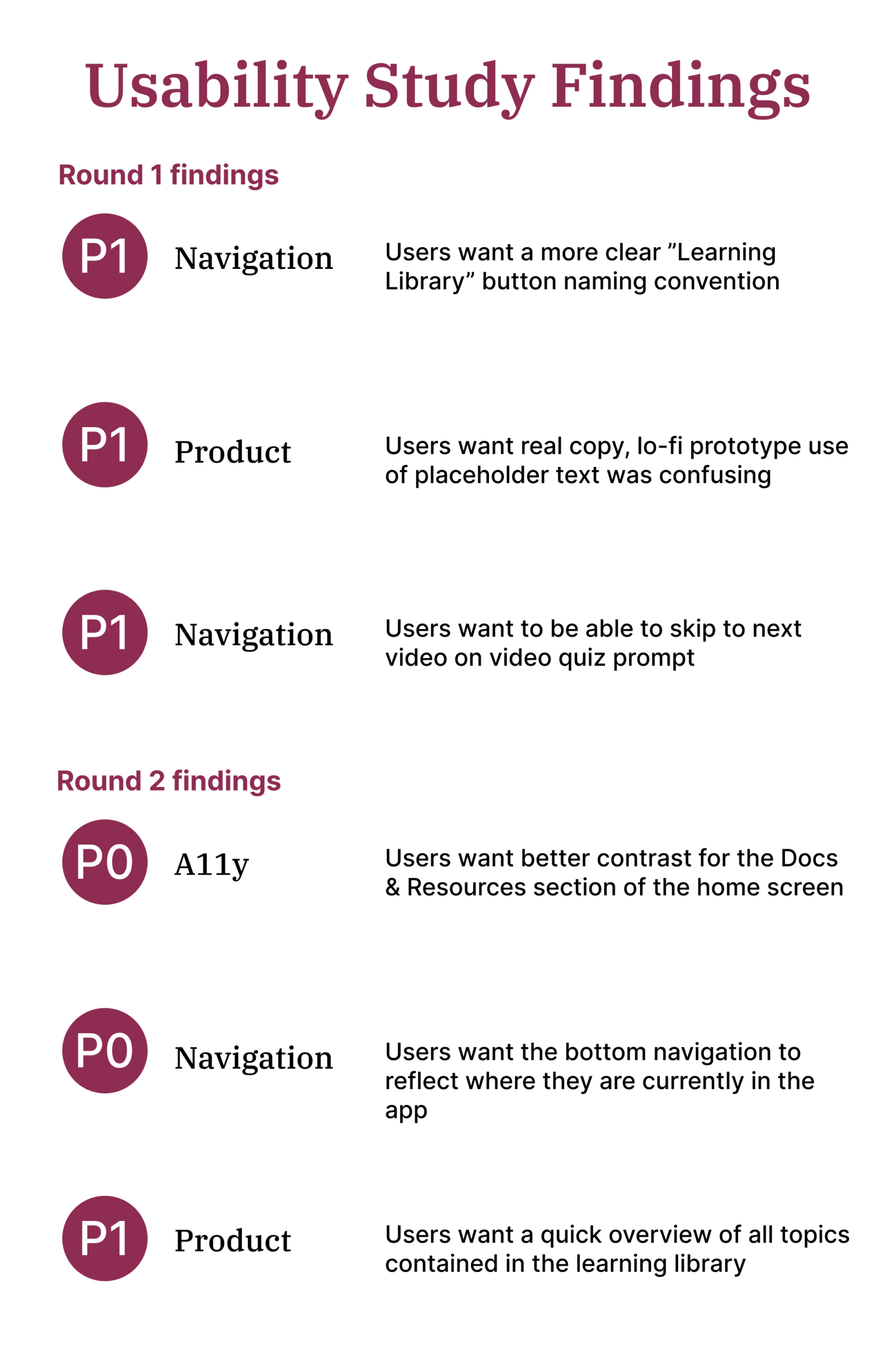
I conducted two rounds of usability studies. Findings from the first study helped guide the designs from wireframes to mockups. The second study used a high-fidelity prototype and revealed what aspects of the mockups needed refining
Mockups
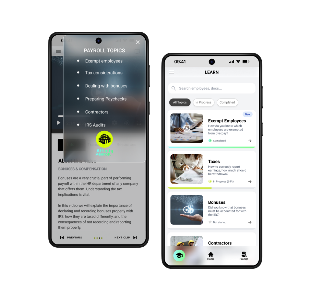
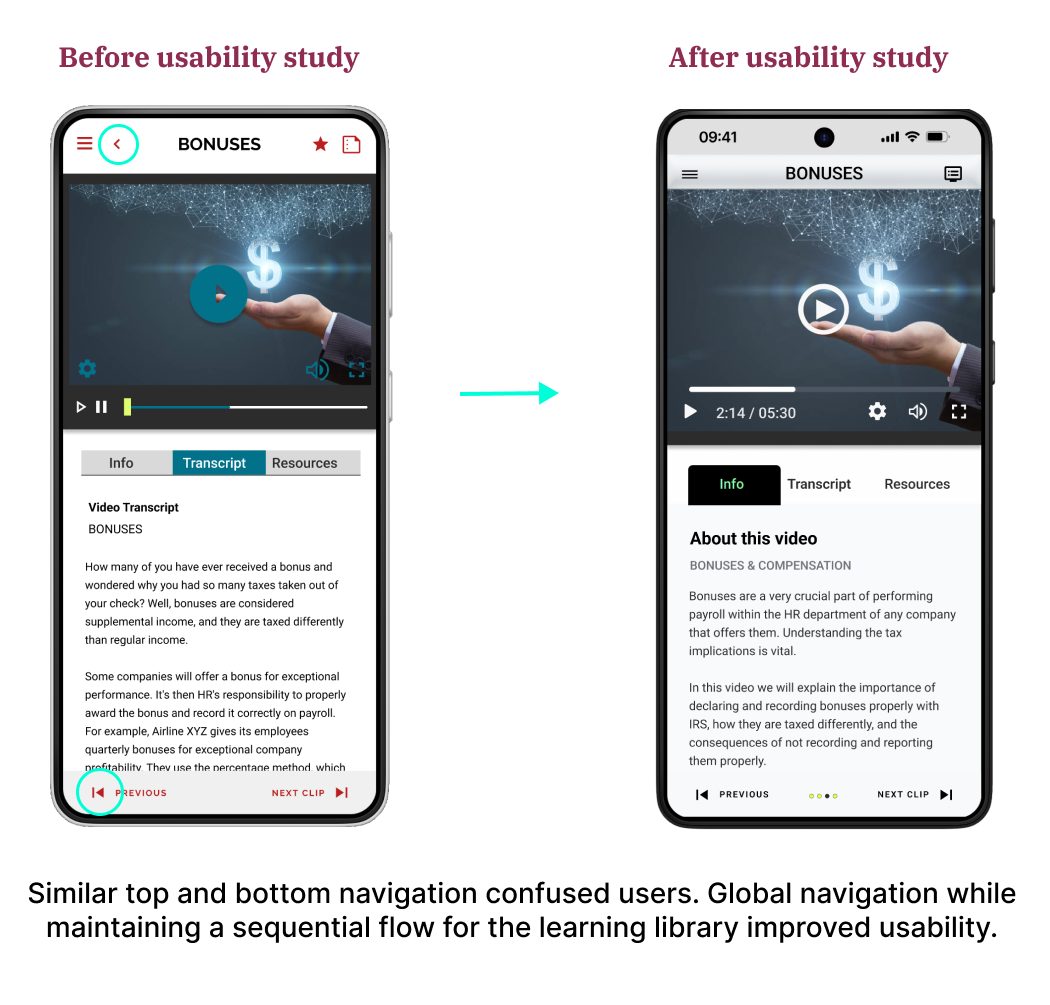
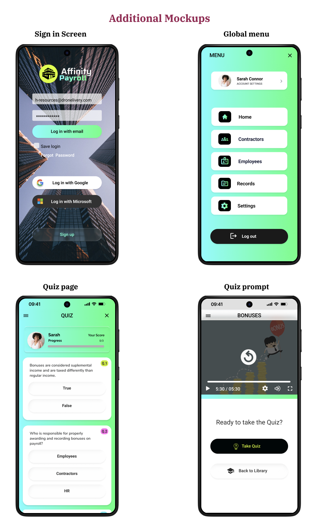
The original low-fidelity designs contained the fundamentals of IA and navigation, but after two round of usability testing I was able to improve the usability of the design with containment, a clear navigation bar with suitable iconography and clear text labels as well as a clean professional brand and visual design
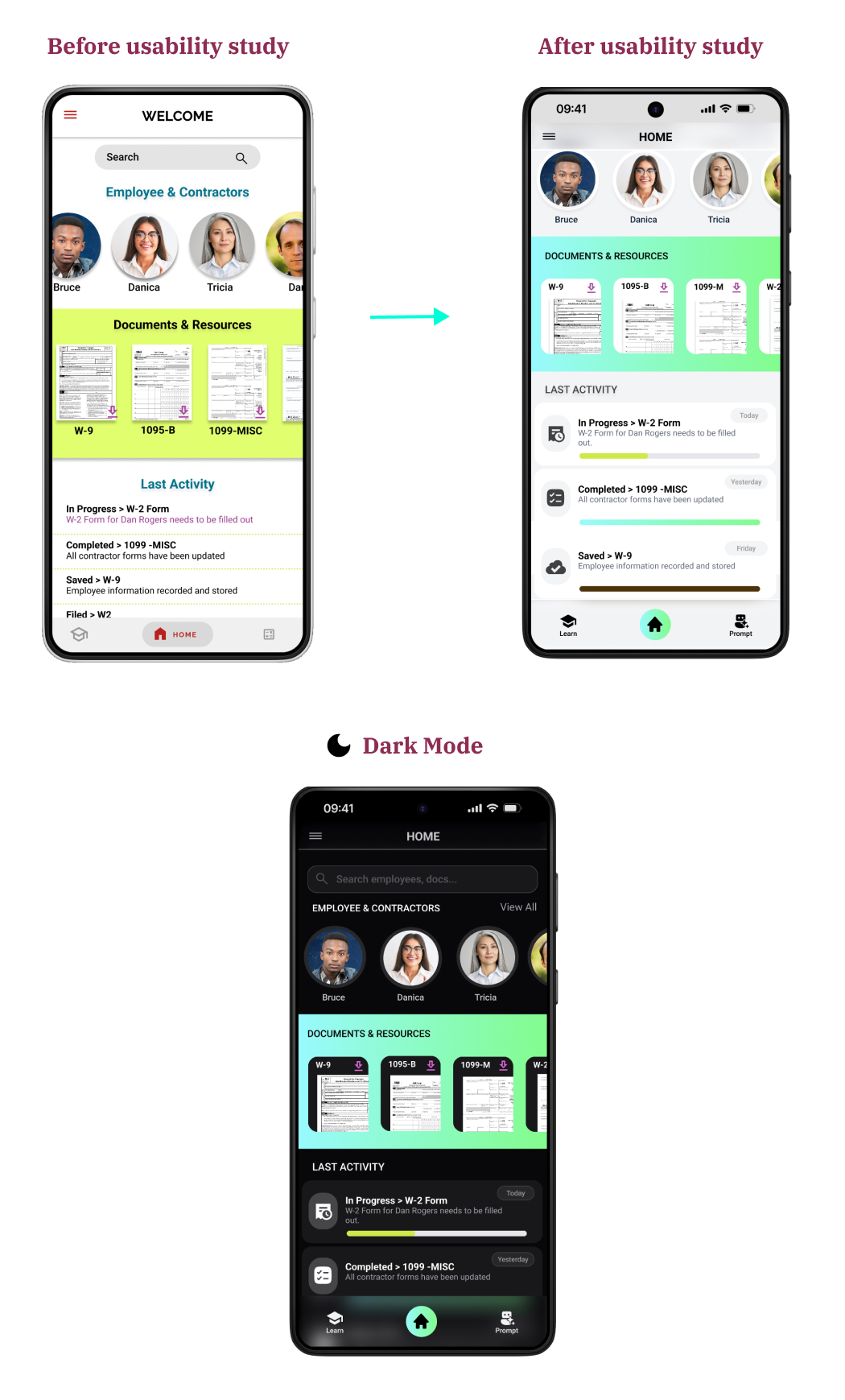
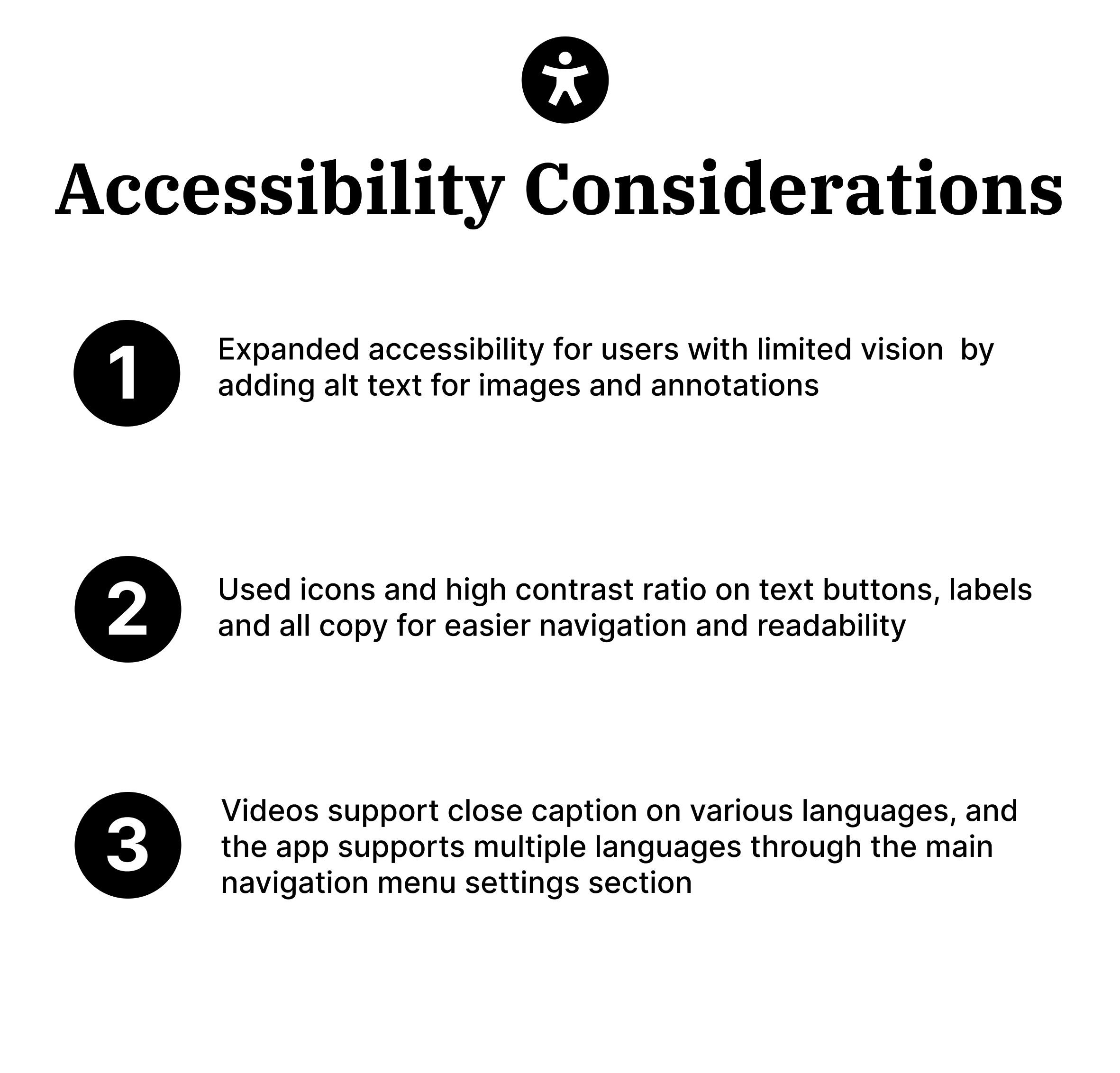
The second usability study revealed frustrations with the bottom navigation as it didn’t provide clear text labels indicating intended functionality. Colors were also refined for accessibility and it produced a more professional look in line with the apps brand and purpose
Introducing the HR Assistant
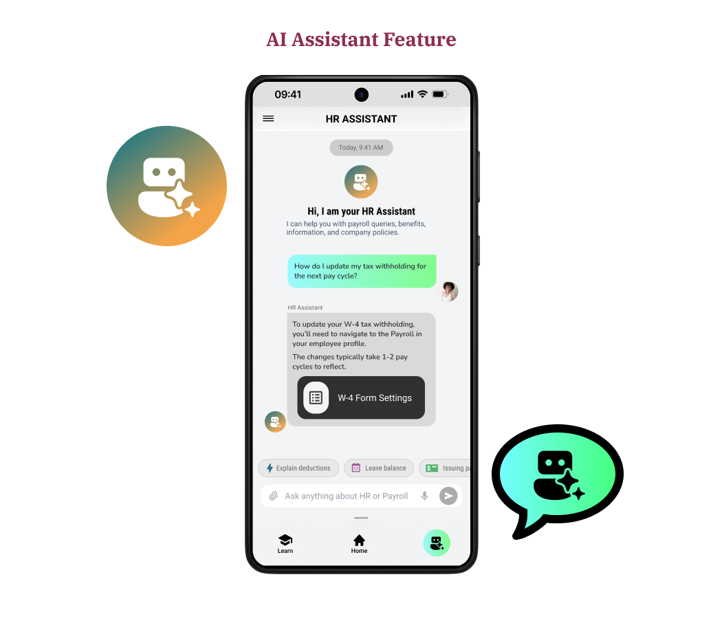
To bridge the gap between complex payroll regulations and the limited HR expertise of small business owners, I integrated an AI-driven HR Assistant directly into the Affinity Payroll ecosystem. Powered by a Large Language Model (LLM) with specialized contextual awareness of tax laws, this assistant moves beyond the traditional chatbot by offering a conversational interface that simplifies dense workflows into natural dialogue.
By utilizing Natural Language Processing (NLP) to interpret nuanced user inquiries and providing proactive, data-backed suggestions, the Assistant serves as an educational layer that reduces cognitive load, empowers users to resolve payroll queries independently, and eliminates the “intimidation factor” inherent in financial management.
Going forward

The app learning library feature filled an important gap in the market while addressing a very crucial challenge for one of the app’s main user groups
One quote from a usability test participant: “I really like the idea of having a place I can go within the app to learn what I need in order to get payroll done, otherwise it is intimidating and overwhelming to do it”

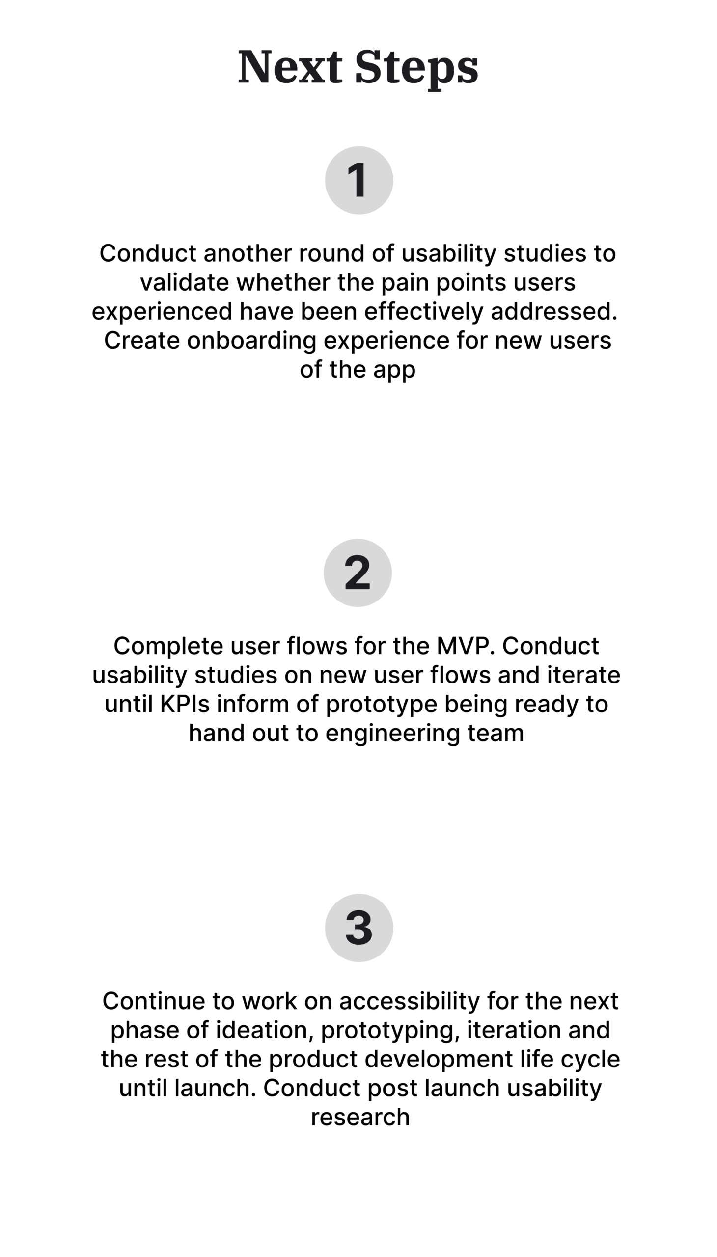
I learned from empathizing with users the challenges involved in the task of running payroll for their business. Through foundational research and competitive audits I identified a need that wasn’t being met in the market. This was just a starting point for ideation and developing working models and prototypes
However, the implementation of my design ideas would have not resulted in a useful, equitable, usable and enjoyable experience without proper usability studies and the actionable insights synthesized from that research
